> ## Documentation Index
> Fetch the complete documentation index at: https://docs.dash360.com/llms.txt
> Use this file to discover all available pages before exploring further.
# Cost Class Curves
> Visualize how multiple cost classes accumulate over time as interactive spline curves, with period and cumulative views and a summary data grid.
 ## Overview
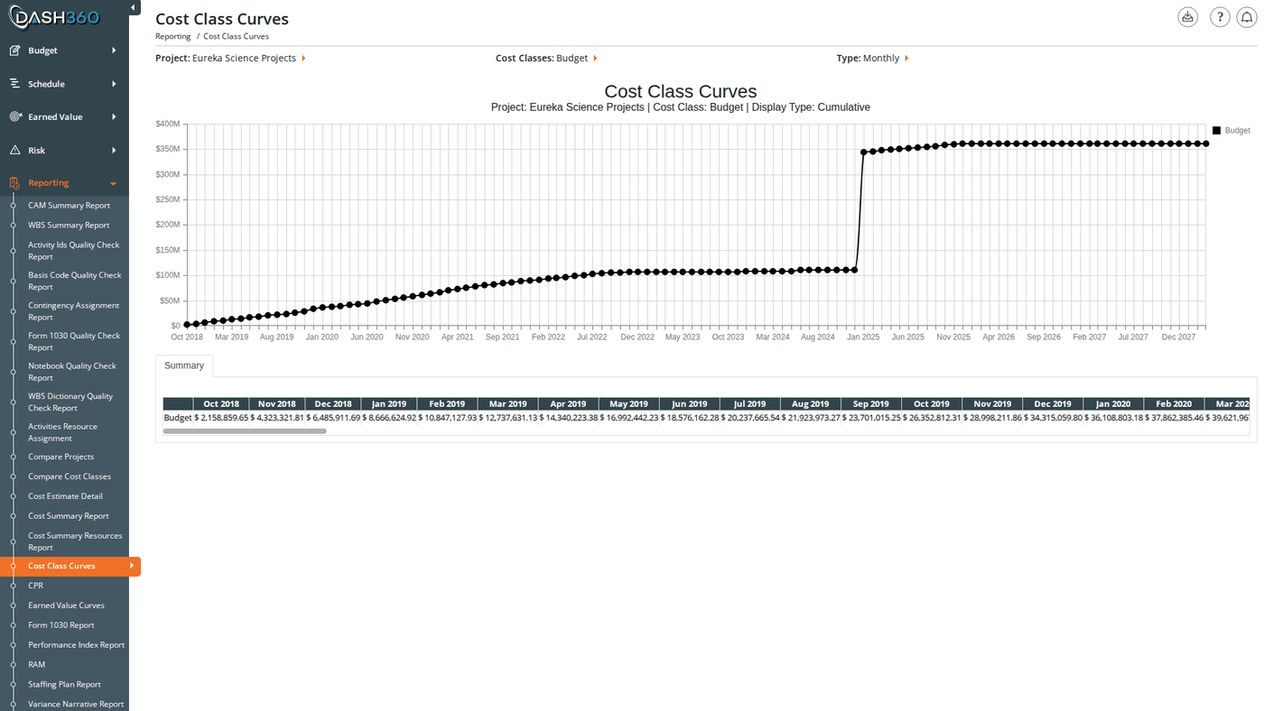
Cost Class Curves plots your selected cost classes as spline curves on a single chart, letting you compare how Budget, Actual, EAC, and any other configured cost classes accumulate across the project timeline. This makes it easy to spot when actuals begin to diverge from budget, or to compare a current estimate against previous baselines.
A data grid below the chart shows the exact values for each period alongside the chart.
**URL:** `/Reporting/CostClassCurvesReport/Index`
***
## Prerequisites
* Select a **project** and at least one **cost class**. The chart does not render until both are selected.
***
## Filters
| Filter | What It Controls |
| ------------------------- | ----------------------------------------------------------------------------------------------------------------------------------------------------------------------------------------------------------------------------------------- |
| **Project** | The project to analyze. Selecting a project loads that project's available cost classes. |
| **Cost Class** | One or more cost classes to plot. Displayed as checkboxes; select multiple to overlay curves. Default: Budget. |
| **Cumulative / Period** | Toggle between cumulative totals and period-by-period values. Default: Cumulative. Hidden for custom calendar projects. |
| **Type** | Switch between Monthly and yearly time increments. Default: Monthly. The yearly option is labeled **Calendar Year** or **Fiscal Year** to match the project's year setting. Replaced by a Calendar dropdown for custom calendar projects. |
| **WBS** | Limit the curves to a specific WBS element. Populates the Work Package filter. |
| **Work Package** | Limit to a specific work package. Only available after selecting a WBS. |
| **CAM** | Limit to a specific Control Account Manager. |
| **Start Date / End Date** | Zoom the chart to a specific date range. Hidden for custom calendar projects. |
### Additional Filters
The following filter sections appear when the selected project has applicable data configured. They are hidden if no relevant codes are set up for the project.
| Filter Section | What It Controls |
| ------------------------- | --------------------------------------------------- |
| **WBS Notebook** | Filter by WBS-level notebook field values |
| **Work Package Notebook** | Filter by work package notebook field values |
| **RA Notebook** | Filter by resource assignment notebook field values |
| **Resource Code Codes** | Filter by resource code classification |
| **Resource Result Codes** | Filter by resource result type classification |
### Custom Calendar Projects
For projects configured with a custom calendar:
* The **Axis** dropdown is replaced by a **Calendar** dropdown listing the project's named calendars
* The **Cumulative / Period** toggle is hidden
* The **Date Range** fields are hidden
* Data grid column headers use the calendar's period labels
### Filter Cascades
* Selecting a **Project** fetches that project's cost classes and populates the cost class checkboxes. If the project has no cost classes configured, an error message appears.
* Selecting a **WBS** populates the Work Package filter. If no WBS is selected, the Work Package dropdown shows "Select a WBS…" and cannot be used.
***
## Reading the Chart
Each selected cost class appears as a separate **spline curve**. Colors are assigned per cost class by your administrator. The legend is positioned in the upper right of the chart.
Toggle between two views using the **Cumulative / Period** selector:
| View | Description |
| -------------- | ---------------------------------------------------------------------------------------------------------------------------------------------- |
| **Cumulative** | Each data point shows the running total cost accumulated from project start through that period. Use this to see the overall spend trajectory. |
| **Period** | Each data point shows only the cost incurred in that specific period. Use this to identify spikes or drops in activity. |
Switch between **Monthly** and the yearly option (**Calendar Year** or **Fiscal Year**, depending on the project's year setting) on the Type selector to adjust the time granularity on the horizontal axis. On a fiscal-year project, yearly points are labeled with an `FY` prefix (for example, `FY2026`).
Hover over any data point to see the exact value for that period.
Use the chart legend to show or hide individual cost class curves by clicking a series name.
***
## Summary Data Grid
Below the chart, the data grid shows the cost values behind each curve broken out by period.
* In **Monthly** mode, column headers use `Dec 2024` format
* In yearly mode, column headers show the year: `FY2026` on a fiscal-year project, or the plain year (`2026`) on a calendar-year project
* For **custom calendar** projects, column headers use the calendar's period labels
* In **Period** view, a **Total** column is added showing the sum across all displayed periods
* In **Cumulative** view, there is no Total column (the final period value represents the total)
The grid is read-only with a fixed column layout; no column chooser, reordering, or sorting.
***
## When to Use This Report
Use Cost Class Curves when you need to:
* **Track budget vs. actuals over time**: overlay Budget and Actual curves to see when and how fast spending is diverging from plan.
* **Compare estimate revisions**: plot original budget alongside a revised estimate to visualize scope changes across the timeline.
* **Identify cost acceleration**: switch to Period view to spot months or fiscal years with unusually high or low activity.
* **Scope down to a work area**: use the WBS and Work Package filters to isolate a specific part of the project for targeted analysis.
* **Benchmark against EAC**: add an Estimate at Completion curve alongside Budget and Actual to assess overall project health in one view.
***
## Saved Views
Cost Class Curves supports named saved views that preserve your filter selections and column layout. Use the view selector in the toolbar to save and reload your own named views.
When viewing a system view, the message "Currently viewing a system view. Changes will not be saved." appears at the top right of the grid.
***
## Exporting
Click the **Download** icon and select **Export as Excel**. The file is saved as `CCCurves.xlsx` with two sheets:
| Sheet | Contents |
| ------------------- | --------------------------------------------------------------- |
| **CC Chart** | The chart exported as an embedded PNG image |
| **CC Summary Data** | The data grid values for all displayed periods and cost classes |
***
## Overview
Cost Class Curves plots your selected cost classes as spline curves on a single chart, letting you compare how Budget, Actual, EAC, and any other configured cost classes accumulate across the project timeline. This makes it easy to spot when actuals begin to diverge from budget, or to compare a current estimate against previous baselines.
A data grid below the chart shows the exact values for each period alongside the chart.
**URL:** `/Reporting/CostClassCurvesReport/Index`
***
## Prerequisites
* Select a **project** and at least one **cost class**. The chart does not render until both are selected.
***
## Filters
| Filter | What It Controls |
| ------------------------- | ----------------------------------------------------------------------------------------------------------------------------------------------------------------------------------------------------------------------------------------- |
| **Project** | The project to analyze. Selecting a project loads that project's available cost classes. |
| **Cost Class** | One or more cost classes to plot. Displayed as checkboxes; select multiple to overlay curves. Default: Budget. |
| **Cumulative / Period** | Toggle between cumulative totals and period-by-period values. Default: Cumulative. Hidden for custom calendar projects. |
| **Type** | Switch between Monthly and yearly time increments. Default: Monthly. The yearly option is labeled **Calendar Year** or **Fiscal Year** to match the project's year setting. Replaced by a Calendar dropdown for custom calendar projects. |
| **WBS** | Limit the curves to a specific WBS element. Populates the Work Package filter. |
| **Work Package** | Limit to a specific work package. Only available after selecting a WBS. |
| **CAM** | Limit to a specific Control Account Manager. |
| **Start Date / End Date** | Zoom the chart to a specific date range. Hidden for custom calendar projects. |
### Additional Filters
The following filter sections appear when the selected project has applicable data configured. They are hidden if no relevant codes are set up for the project.
| Filter Section | What It Controls |
| ------------------------- | --------------------------------------------------- |
| **WBS Notebook** | Filter by WBS-level notebook field values |
| **Work Package Notebook** | Filter by work package notebook field values |
| **RA Notebook** | Filter by resource assignment notebook field values |
| **Resource Code Codes** | Filter by resource code classification |
| **Resource Result Codes** | Filter by resource result type classification |
### Custom Calendar Projects
For projects configured with a custom calendar:
* The **Axis** dropdown is replaced by a **Calendar** dropdown listing the project's named calendars
* The **Cumulative / Period** toggle is hidden
* The **Date Range** fields are hidden
* Data grid column headers use the calendar's period labels
### Filter Cascades
* Selecting a **Project** fetches that project's cost classes and populates the cost class checkboxes. If the project has no cost classes configured, an error message appears.
* Selecting a **WBS** populates the Work Package filter. If no WBS is selected, the Work Package dropdown shows "Select a WBS…" and cannot be used.
***
## Reading the Chart
Each selected cost class appears as a separate **spline curve**. Colors are assigned per cost class by your administrator. The legend is positioned in the upper right of the chart.
Toggle between two views using the **Cumulative / Period** selector:
| View | Description |
| -------------- | ---------------------------------------------------------------------------------------------------------------------------------------------- |
| **Cumulative** | Each data point shows the running total cost accumulated from project start through that period. Use this to see the overall spend trajectory. |
| **Period** | Each data point shows only the cost incurred in that specific period. Use this to identify spikes or drops in activity. |
Switch between **Monthly** and the yearly option (**Calendar Year** or **Fiscal Year**, depending on the project's year setting) on the Type selector to adjust the time granularity on the horizontal axis. On a fiscal-year project, yearly points are labeled with an `FY` prefix (for example, `FY2026`).
Hover over any data point to see the exact value for that period.
Use the chart legend to show or hide individual cost class curves by clicking a series name.
***
## Summary Data Grid
Below the chart, the data grid shows the cost values behind each curve broken out by period.
* In **Monthly** mode, column headers use `Dec 2024` format
* In yearly mode, column headers show the year: `FY2026` on a fiscal-year project, or the plain year (`2026`) on a calendar-year project
* For **custom calendar** projects, column headers use the calendar's period labels
* In **Period** view, a **Total** column is added showing the sum across all displayed periods
* In **Cumulative** view, there is no Total column (the final period value represents the total)
The grid is read-only with a fixed column layout; no column chooser, reordering, or sorting.
***
## When to Use This Report
Use Cost Class Curves when you need to:
* **Track budget vs. actuals over time**: overlay Budget and Actual curves to see when and how fast spending is diverging from plan.
* **Compare estimate revisions**: plot original budget alongside a revised estimate to visualize scope changes across the timeline.
* **Identify cost acceleration**: switch to Period view to spot months or fiscal years with unusually high or low activity.
* **Scope down to a work area**: use the WBS and Work Package filters to isolate a specific part of the project for targeted analysis.
* **Benchmark against EAC**: add an Estimate at Completion curve alongside Budget and Actual to assess overall project health in one view.
***
## Saved Views
Cost Class Curves supports named saved views that preserve your filter selections and column layout. Use the view selector in the toolbar to save and reload your own named views.
When viewing a system view, the message "Currently viewing a system view. Changes will not be saved." appears at the top right of the grid.
***
## Exporting
Click the **Download** icon and select **Export as Excel**. The file is saved as `CCCurves.xlsx` with two sheets:
| Sheet | Contents |
| ------------------- | --------------------------------------------------------------- |
| **CC Chart** | The chart exported as an embedded PNG image |
| **CC Summary Data** | The data grid values for all displayed periods and cost classes |
***