> ## Documentation Index
> Fetch the complete documentation index at: https://docs.dash360.com/llms.txt
> Use this file to discover all available pages before exploring further.
# Building Charts
> Step-by-step build guides for every chart type: Pie, Doughnut, Bar, Side-by-Side Bar, Stacked Bar, Line, Spline, Area, and Trellis, with every option and pitfalls.
# Building Charts
Report Studio offers nine chart types. They all read the same project cost data and share a similar setup, so once you learn one, the rest are easy. This page covers the common concepts first, then each chart type in detail.
This page is part of the [Report Studio](/user-guide/reporting/report-designer) guide.
## Concepts shared by all charts
### The wizard
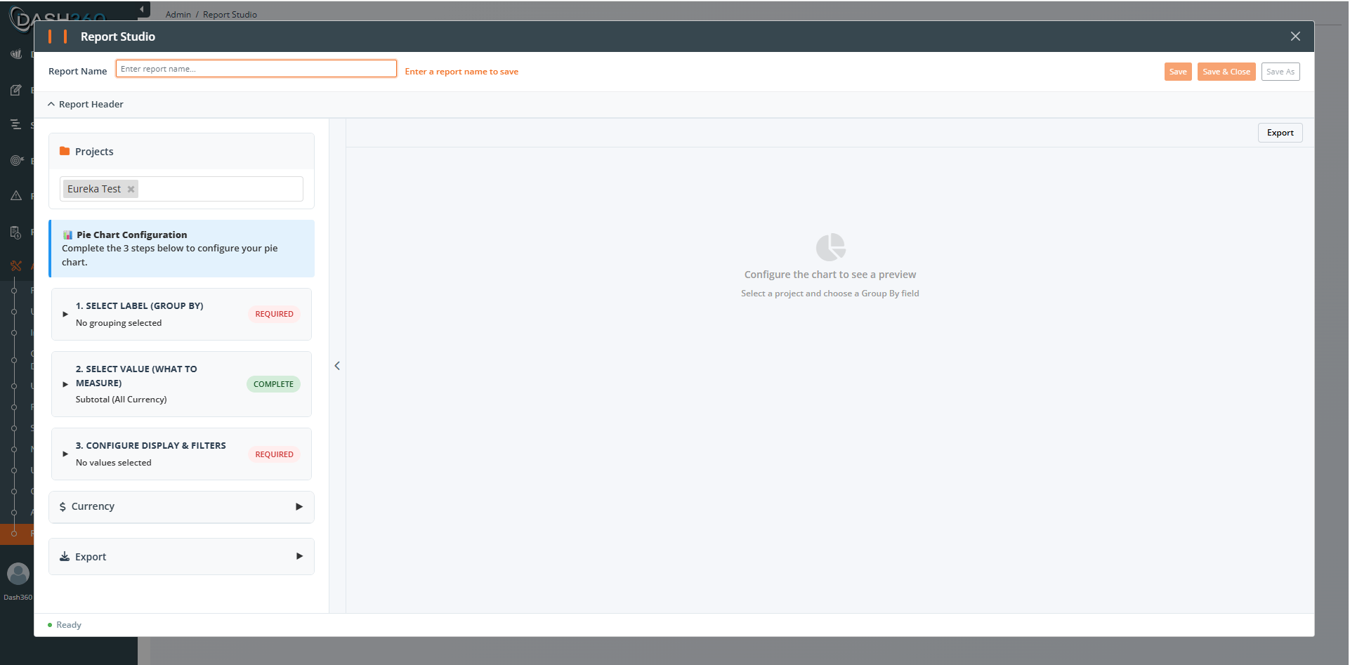
Chart setup is a short wizard of collapsible steps. Each step header shows a status badge:
* **Required** (red): you must complete this step.
* **Complete** (green): the step is done.
* **Optional** (gray): you can skip it.
Click a step header to open or close it. The preview updates as you go.
 ### Group By (the category or series)
Every chart needs something to group by. You choose a field such as WBS (with an inline **Level 1 to 6** selector), CAM, Cost Class, Resource Type, or any dynamic field. Each unique value becomes a slice, bar, line, or panel.
### Value Type (what to measure)
You then choose what to measure:
* **Subtotal (All Currency Resource Results)**: sum all currency values.
* **Specific Resource Result(s)**: pick particular resource results from a tag box.
### Time period (trend and time-based charts)
Charts that show data over time let you pick the time axis: fiscal year, monthly, or a calendar period. Two helpers appear depending on your choice:
* **Smart Monthly**: when you choose monthly, set how many months to show and where the window starts.
* **Calendar Unassigned**: when you choose a calendar period, decide how to label periods outside the defined ranges.
### Filters
Every chart has a Filters section. By default, Resource Type is set to Labor, Non-Labor, and Travel. Add filters to focus the chart.
### Series options (color, caption, visibility)
Where a chart has multiple series or categories, you can set each one's color, edit its caption, and show or hide it, with Select All / Unselect All helpers.
***
## Pie and Doughnut
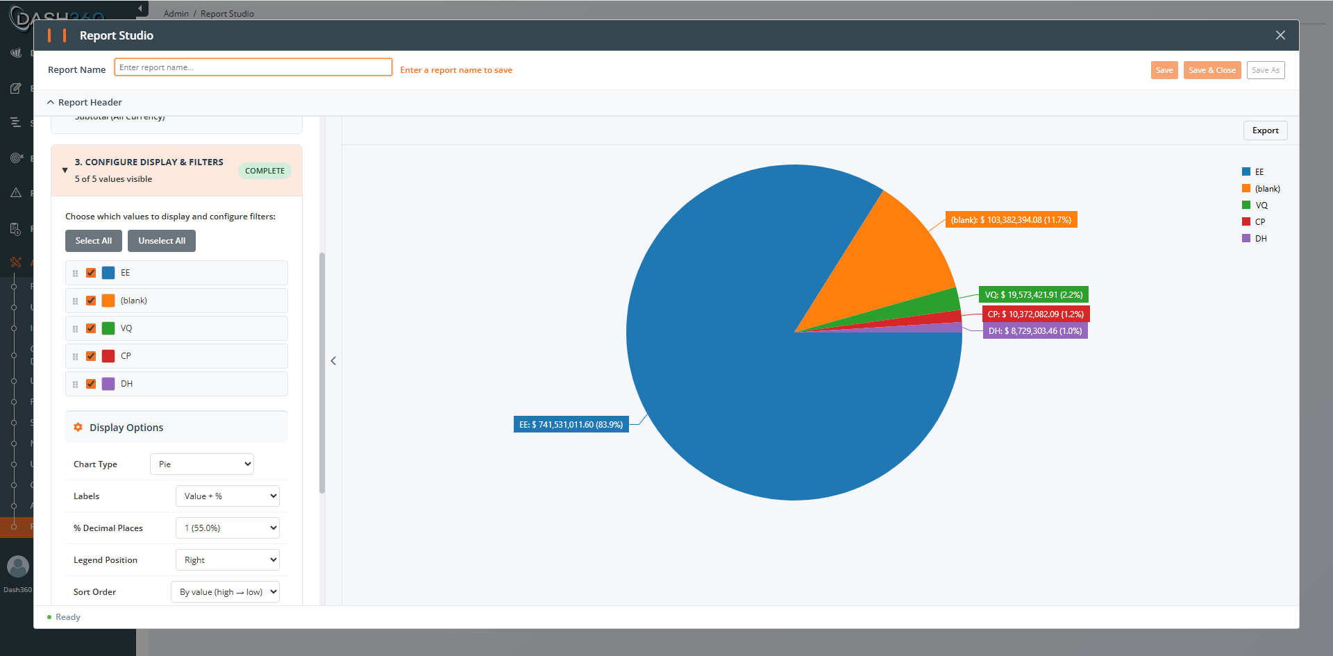
Best for showing proportions of a whole, for example cost share by Resource Type. A Doughnut is a Pie with a hollow center.
**Steps:** 1. Select Label (Group By), 2. Select Value, 3. Configure Display & Filters.
**Display options:**
| Option | Choices | Notes |
| --------------------------------- | ------------------------------------------------------------ | -------------------------------------------------------------------------------------------------------------------------------------------------------------------------------------------------------------------------------------------------------------------------------------------------------------------------------------------------------------------------------------------------------------- |
| **Chart Type** | Pie, Doughnut | |
| **Inner Radius** | 10% to 90% | Doughnut only; controls hole size (default 50%) |
| **Labels** | Value + %, % only, Value only, None | Default Value + % |
| **% Decimal Places** | 0 to 4 | Decimal places for every percentage (slice labels, tooltip, and data table). Default 1. Increase it so tiny slices show their real value (e.g. 0.01%) instead of rounding to 0.0% |
| **Legend Position** | Bottom, Right, Left, Top, Hidden | Default Right |
| **Sort Order** | By value (high to low), By value (low to high), Alphabetical | Default high to low |
| **Group Small Values** | Off, below 1%, 2%, 3%, 5%, 10% | Combines tiny slices into one "Other" slice |
| **Include Data Table** | On / Off | Shows a table beneath the chart. When on, choose a **Style**: Standard or Time-phased (see below) |
| **Data Table Style: Standard** | Default | The classic table: one row per slice. Choose which columns appear (**Value** and **%** show by default, **Records** is off by default; the group-by label column is always shown) and toggle **Show Total Row** |
| **Data Table Style: Time-phased** | Optional | One row per slice with a column per time period. Choose the **Time Period** (Fiscal Year, Monthly with a month-range picker, or a Calendar Period), and toggle **Show Column Grand Total** (a Total column on the right; each slice's total matches its pie value) and **Show Row Grand Total** (a Total row at the bottom with per-period totals), each with an optional caption. Both totals show by default |
Use **Group Small Values** when a pie has a long tail of tiny slices. It keeps the chart readable by rolling small slices into one. Note that the Time-phased table lists every slice individually; small values are not grouped there.
The data table sits beneath the chart and scrolls with the report, so a grouping with many values shows every row and the grand totals. Exporting the report to Excel follows whichever table style and totals are selected.
### Group By (the category or series)
Every chart needs something to group by. You choose a field such as WBS (with an inline **Level 1 to 6** selector), CAM, Cost Class, Resource Type, or any dynamic field. Each unique value becomes a slice, bar, line, or panel.
### Value Type (what to measure)
You then choose what to measure:
* **Subtotal (All Currency Resource Results)**: sum all currency values.
* **Specific Resource Result(s)**: pick particular resource results from a tag box.
### Time period (trend and time-based charts)
Charts that show data over time let you pick the time axis: fiscal year, monthly, or a calendar period. Two helpers appear depending on your choice:
* **Smart Monthly**: when you choose monthly, set how many months to show and where the window starts.
* **Calendar Unassigned**: when you choose a calendar period, decide how to label periods outside the defined ranges.
### Filters
Every chart has a Filters section. By default, Resource Type is set to Labor, Non-Labor, and Travel. Add filters to focus the chart.
### Series options (color, caption, visibility)
Where a chart has multiple series or categories, you can set each one's color, edit its caption, and show or hide it, with Select All / Unselect All helpers.
***
## Pie and Doughnut
Best for showing proportions of a whole, for example cost share by Resource Type. A Doughnut is a Pie with a hollow center.
**Steps:** 1. Select Label (Group By), 2. Select Value, 3. Configure Display & Filters.
**Display options:**
| Option | Choices | Notes |
| --------------------------------- | ------------------------------------------------------------ | -------------------------------------------------------------------------------------------------------------------------------------------------------------------------------------------------------------------------------------------------------------------------------------------------------------------------------------------------------------------------------------------------------------- |
| **Chart Type** | Pie, Doughnut | |
| **Inner Radius** | 10% to 90% | Doughnut only; controls hole size (default 50%) |
| **Labels** | Value + %, % only, Value only, None | Default Value + % |
| **% Decimal Places** | 0 to 4 | Decimal places for every percentage (slice labels, tooltip, and data table). Default 1. Increase it so tiny slices show their real value (e.g. 0.01%) instead of rounding to 0.0% |
| **Legend Position** | Bottom, Right, Left, Top, Hidden | Default Right |
| **Sort Order** | By value (high to low), By value (low to high), Alphabetical | Default high to low |
| **Group Small Values** | Off, below 1%, 2%, 3%, 5%, 10% | Combines tiny slices into one "Other" slice |
| **Include Data Table** | On / Off | Shows a table beneath the chart. When on, choose a **Style**: Standard or Time-phased (see below) |
| **Data Table Style: Standard** | Default | The classic table: one row per slice. Choose which columns appear (**Value** and **%** show by default, **Records** is off by default; the group-by label column is always shown) and toggle **Show Total Row** |
| **Data Table Style: Time-phased** | Optional | One row per slice with a column per time period. Choose the **Time Period** (Fiscal Year, Monthly with a month-range picker, or a Calendar Period), and toggle **Show Column Grand Total** (a Total column on the right; each slice's total matches its pie value) and **Show Row Grand Total** (a Total row at the bottom with per-period totals), each with an optional caption. Both totals show by default |
Use **Group Small Values** when a pie has a long tail of tiny slices. It keeps the chart readable by rolling small slices into one. Note that the Time-phased table lists every slice individually; small values are not grouped there.
The data table sits beneath the chart and scrolls with the report, so a grouping with many values shows every row and the grand totals. Exporting the report to Excel follows whichever table style and totals are selected.
 ***
## Bar Chart
Best for comparing a single value across categories, for example cost by CAM. Category-based, with no time dimension.
**Steps:** 1. Select Category (Group By), 2. Configure Display.
**Display options:**
| Option | Notes |
| ----------------------------------- | ------------------------------------------------------------------------------ |
| **Legend Position** | Bottom, Right, Left, Top |
| **X-Axis Title** / **Y-Axis Title** | Text labels for the axes |
| **X/Y Axis Title Color** | Color pickers |
| **Show X Axis** | Toggle the horizontal axis |
| **Show Value Labels on Bars** | Print the value on each bar |
| **Show Percentile Line** | Draw a reference line at a percentile (P50 median, P75, P90, P95, P99, or Max) |
| **Show Percentile Value Label** | Label the percentile line with its value |
***
## Side-by-Side Bar
Compares several series next to each other across categories. Shares its setup with the Stacked Bar; the difference is that bars sit beside each other instead of stacking.
**Steps:** 1. Select Group By, 2. Select Time & Value, 3. Series.
See the Stacked Bar options below; they are the same.
***
## Stacked Bar
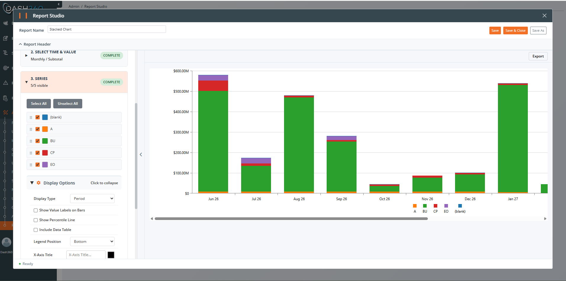
Shows part-to-whole relationships across categories or time, with series stacked into one bar.
**Steps:** 1. Select Series (Stack By), 2. Select Time & Value, 3. Series.
**Display options (Step 3):**
| Option | Notes |
| ------------------------------------------ | --------------------------------------------------------------------------------------------------------------------------------------------- |
| **Display Type** | Period or Cumulative |
| **Show Value Labels on Bars** | Print the value on each segment |
| **Show Percentile Line** + **Value Label** | Reference line at P50 to Max |
| **Show Fiscal Year Prefix on Year Labels** | Auto when projects match; a toggle when fiscal and calendar projects are mixed |
| **Include Data Table** | Shows a table beneath the chart, with: **Show Column Grand Total**, **Column Total Caption**, **Show Row Grand Total**, **Row Total Caption** |
**Cumulative** display turns a period chart into a running total, which is the basis of an S-curve view of spend over time.
***
## Bar Chart
Best for comparing a single value across categories, for example cost by CAM. Category-based, with no time dimension.
**Steps:** 1. Select Category (Group By), 2. Configure Display.
**Display options:**
| Option | Notes |
| ----------------------------------- | ------------------------------------------------------------------------------ |
| **Legend Position** | Bottom, Right, Left, Top |
| **X-Axis Title** / **Y-Axis Title** | Text labels for the axes |
| **X/Y Axis Title Color** | Color pickers |
| **Show X Axis** | Toggle the horizontal axis |
| **Show Value Labels on Bars** | Print the value on each bar |
| **Show Percentile Line** | Draw a reference line at a percentile (P50 median, P75, P90, P95, P99, or Max) |
| **Show Percentile Value Label** | Label the percentile line with its value |
***
## Side-by-Side Bar
Compares several series next to each other across categories. Shares its setup with the Stacked Bar; the difference is that bars sit beside each other instead of stacking.
**Steps:** 1. Select Group By, 2. Select Time & Value, 3. Series.
See the Stacked Bar options below; they are the same.
***
## Stacked Bar
Shows part-to-whole relationships across categories or time, with series stacked into one bar.
**Steps:** 1. Select Series (Stack By), 2. Select Time & Value, 3. Series.
**Display options (Step 3):**
| Option | Notes |
| ------------------------------------------ | --------------------------------------------------------------------------------------------------------------------------------------------- |
| **Display Type** | Period or Cumulative |
| **Show Value Labels on Bars** | Print the value on each segment |
| **Show Percentile Line** + **Value Label** | Reference line at P50 to Max |
| **Show Fiscal Year Prefix on Year Labels** | Auto when projects match; a toggle when fiscal and calendar projects are mixed |
| **Include Data Table** | Shows a table beneath the chart, with: **Show Column Grand Total**, **Column Total Caption**, **Show Row Grand Total**, **Row Total Caption** |
**Cumulative** display turns a period chart into a running total, which is the basis of an S-curve view of spend over time.
 ***
## Line, Spline, and Area
Track cost over time. Line uses straight segments, Spline uses smooth curves, and Area fills under the line. The chart type is set when you create the report; the setup is otherwise identical.
**Steps:** 1. Select Series (Group By), 2. Select Time & Value, 3. Series.
**Display options (Step 3):**
| Option | Notes |
| ------------------------------------------ | --------------------------------------------------- |
| **Show Data Points** | Markers on the line (default on) |
| **Point Size** | 4, 6, 8, 10, or 12 px |
| **Line Width** | 1 to 5 px |
| **Display Type** | Period or Cumulative |
| **Show Value Labels on Points** | Print values at each point |
| **Show Percentile Line** + **Value Label** | Reference line at P50 to Max |
| **Show Fiscal Year Prefix on Year Labels** | Auto or toggle, as above |
| **Include Data Table** | With column/row grand totals and captions, as above |
***
## Trellis (small multiples)
Draws one small chart per group value and lays them out side by side, so you can compare the same pattern across many groups. Each unique value of the Group By field becomes its own chart.
**Steps:** 1. Select Rows (Group By), 2. Select Time & Value, 3. Chart Type & Display.
**Display options (Step 3):**
| Option | Notes |
| ------------------- | ----------------------------------------------------- |
| **Chart Type** | Line, Spline, Scatter, or Bar (per-panel chart style) |
| **Series Captions** | Custom caption per series, with **Reset Captions** |
| **Display Type** | Period or Cumulative |
| **Legend** | Hidden, Bottom, Right, Top |
| **Row Height** | 100 to 300 px per panel row |
***
## Line, Spline, and Area
Track cost over time. Line uses straight segments, Spline uses smooth curves, and Area fills under the line. The chart type is set when you create the report; the setup is otherwise identical.
**Steps:** 1. Select Series (Group By), 2. Select Time & Value, 3. Series.
**Display options (Step 3):**
| Option | Notes |
| ------------------------------------------ | --------------------------------------------------- |
| **Show Data Points** | Markers on the line (default on) |
| **Point Size** | 4, 6, 8, 10, or 12 px |
| **Line Width** | 1 to 5 px |
| **Display Type** | Period or Cumulative |
| **Show Value Labels on Points** | Print values at each point |
| **Show Percentile Line** + **Value Label** | Reference line at P50 to Max |
| **Show Fiscal Year Prefix on Year Labels** | Auto or toggle, as above |
| **Include Data Table** | With column/row grand totals and captions, as above |
***
## Trellis (small multiples)
Draws one small chart per group value and lays them out side by side, so you can compare the same pattern across many groups. Each unique value of the Group By field becomes its own chart.
**Steps:** 1. Select Rows (Group By), 2. Select Time & Value, 3. Chart Type & Display.
**Display options (Step 3):**
| Option | Notes |
| ------------------- | ----------------------------------------------------- |
| **Chart Type** | Line, Spline, Scatter, or Bar (per-panel chart style) |
| **Series Captions** | Custom caption per series, with **Reset Captions** |
| **Display Type** | Period or Cumulative |
| **Legend** | Hidden, Bottom, Right, Top |
| **Row Height** | 100 to 300 px per panel row |
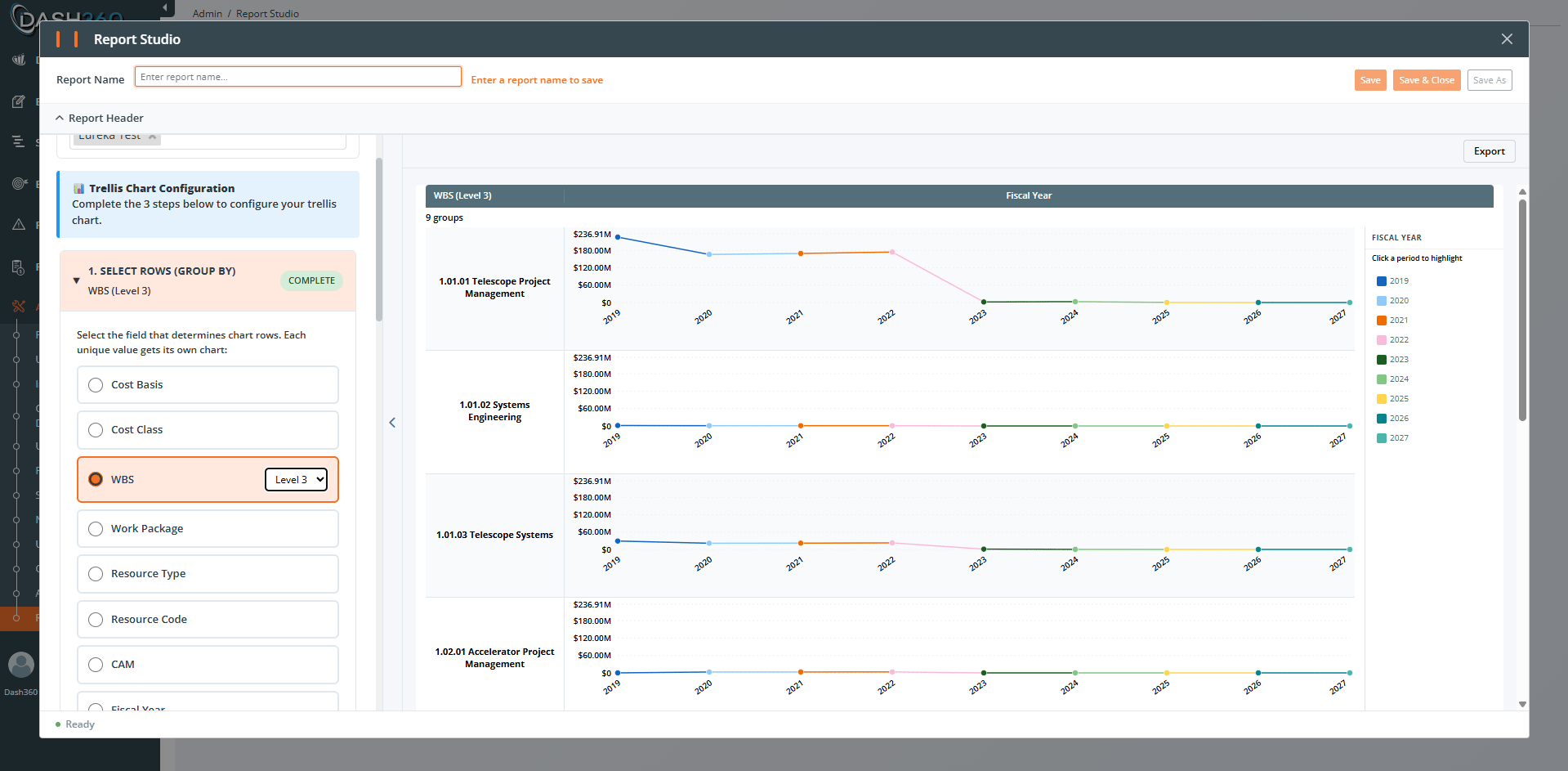 A Group By field with many unique values produces many panels. Filter the group, or pick a higher WBS level, so the trellis stays readable.
***
## Pitfalls to avoid (all charts)
* **Too many categories.** Pies with dozens of slices and bar charts with dozens of bars are hard to read. Filter, group small values (pie), or pick a higher WBS level.
* **Forgetting the Value Type.** If a chart looks empty or wrong, confirm whether you meant Subtotal (all currency) or specific resource results.
* **Mixing Budget, Actual, and Earned in one series unintentionally.** If you do not filter Cost Class, a single bar or slice can blend them. Filter Cost Class, or split values with calculated fields.
* **Default Resource Type filter.** Charts start filtered to Labor, Non-Labor, and Travel. If a category is missing, check this filter.
* **Cumulative vs Period confusion.** Cumulative shows a running total; Period shows each period on its own. Pick deliberately.
## Where to go next
Snapshots, filters, permissions, and caching.
Ready-to-use formulas and how to fix wrong results.
A Group By field with many unique values produces many panels. Filter the group, or pick a higher WBS level, so the trellis stays readable.
***
## Pitfalls to avoid (all charts)
* **Too many categories.** Pies with dozens of slices and bar charts with dozens of bars are hard to read. Filter, group small values (pie), or pick a higher WBS level.
* **Forgetting the Value Type.** If a chart looks empty or wrong, confirm whether you meant Subtotal (all currency) or specific resource results.
* **Mixing Budget, Actual, and Earned in one series unintentionally.** If you do not filter Cost Class, a single bar or slice can blend them. Filter Cost Class, or split values with calculated fields.
* **Default Resource Type filter.** Charts start filtered to Labor, Non-Labor, and Travel. If a category is missing, check this filter.
* **Cumulative vs Period confusion.** Cumulative shows a running total; Period shows each period on its own. Pick deliberately.
## Where to go next
Snapshots, filters, permissions, and caching.
Ready-to-use formulas and how to fix wrong results.