Earned Value Curves

Overview

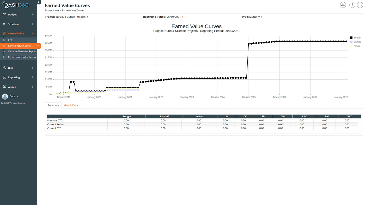
The Earned Value Curves report plots three core EVM metrics over your project timeline as S-curves; Budget (BCWS), Earned Value (BCWP), and Actual Cost (ACWP). The shape and relative position of these curves tells you at a glance whether you are ahead of or behind schedule and whether you are over or under budget. Below the chart, two tabs provide tabular views of the data: a Summary grid with key performance metrics and a Graph Data grid with the raw time-series values behind the chart. URL: /EarnedValue/EarnedValueCurves/Index

Prerequisites

  • Select a project and reporting period. The chart and data grids do not load until both are selected.

Reading the Chart

The chart plots three spline curves over your project timeline:
CurveEVM TermWhat It Means
BudgetBCWS: Budgeted Cost of Work ScheduledThe cumulative planned value of all work scheduled through each period
EarnedBCWP: Budgeted Cost of Work PerformedThe cumulative planned value of work actually completed through each period
ActualACWP: Actual Cost of Work PerformedThe cumulative cost of completed work through each period
Reading the gap between curves:
  • If the Earned curve is below the Budget curve, the project is behind schedule (negative Schedule Variance).
  • If the Actual curve is above the Earned curve, the project is over budget (negative Cost Variance).
Chart interactions:
  • Click any legend item to show or hide that curve.
  • Hover over a data point to see the exact value for that period.
  • Zoom by clicking and dragging on the chart to focus on a specific date or value range.
  • Pan by holding and dragging after zooming to scroll along the axis.
Chart subtitle: When secondary filters are active (WBS, Work Package, CAM, Currency Format, Start/End Date), the chart subtitle automatically updates to list all active filter values; for example, “Project: My Project | Reporting Period: Jan 2024 | WBS: 1.01 | CAM: Smith”. This subtitle carries through to the Excel export.

Summary Tab

The Summary tab (active by default) shows a metrics grid with three rows:
RowDescription
Previous CumulativeCumulative EV metrics as of the reporting period prior to the selected one
Current PeriodEV metrics for the selected reporting period only (period-to-period delta)
Current CumulativeCumulative EV metrics as of the selected reporting period
Each row shows the following columns:
ColumnDefinition
BudgetBudgeted Cost of Work Scheduled (BCWS)
EarnedBudgeted Cost of Work Performed (BCWP)
ActualActual Cost of Work Performed (ACWP)
SVSchedule Variance = Earned − Budget. Negative = behind schedule.
CVCost Variance = Earned − Actual. Negative = over budget.
SPISchedule Performance Index = Earned ÷ Budget. Below 1.0 = behind schedule.
CPICost Performance Index = Earned ÷ Actual. Below 1.0 = over budget.
BACBudget at Completion: total approved budget
EACEstimate at Completion = CTD Actual + BAC − CTD Earned
VACVariance at Completion = BAC − EAC. Negative = forecast over budget.

Graph Data Tab

The Graph Data tab shows the raw time-series data behind the chart; one row per period from project start through the selected reporting period.
ColumnDescription
Reporting PeriodThe period date (formatted as month/year in Monthly mode, year in Yearly mode)
PlannedCumulative Budget (BCWS) for that period
EarnedCumulative Earned Value (BCWP) for that period
ActualCumulative Actual Cost (ACWP) for that period
This tab is useful for verifying data or copying period-level values for external analysis.

Available Filters

The Project and Reporting Period selectors appear in the page header. All other filters are in the left-side filter panel, which activates after a reporting period is selected.
FilterDescriptionDefault
ProjectRequired. Loads reporting periods for the selected project.:
Reporting PeriodRequired. Sets the “as of” date for all calculations.:
AxisSets the time granularity of the chart x-axis: Monthly or Yearly.Monthly
WBSLimit the curves to a specific WBS element and its children. Selecting a WBS also filters the Work Package dropdown.All WBS
Work PackageFurther limit to a single work package. Populated based on the selected WBS; select a WBS first.All WPs
CAMLimit to work packages assigned to a specific Control Account Manager.All CAMs
Start DateTrim the chart to start at this date. Combined with End Date to zoom to a specific window.Project start
End DateTrim the chart to end at this date.Project end
Currency FormatOverride the display divisor for this session.Registry / User Setting
Currency Format options:
OptionEffect
None: Use Registry / User SettingUses the project’s configured currency format
DefaultDisplay values in base currency
K ValueDisplay in thousands
M ValueDisplay in millions

When to Use This Report

Use EV Curves at the start of any status review to establish the overall performance picture before diving into CPR detail. The S-curve immediately reveals whether performance is improving or degrading over time; something a tabular report alone cannot show. Use the Axis toggle to switch between monthly granularity (useful for recent periods) and yearly (useful for long-range projects to see the full arc of performance). Use the WBS and Work Package filters to narrow the curves to a specific area of the project when investigating a localized cost or schedule issue.

Exporting

Click the Download icon and select Export to Excel to download EVCurves.xlsx. The workbook contains three sheets:
SheetContents
EV ChartThe S-curve chart as an embedded image
EV Summary DataThe Summary grid (Previous Cumulative / Current Period / Current Cumulative rows with all metric columns)
EV Chart DataThe Graph Data grid (one row per period with Reporting Period, Planned, Earned, Actual)