Overview
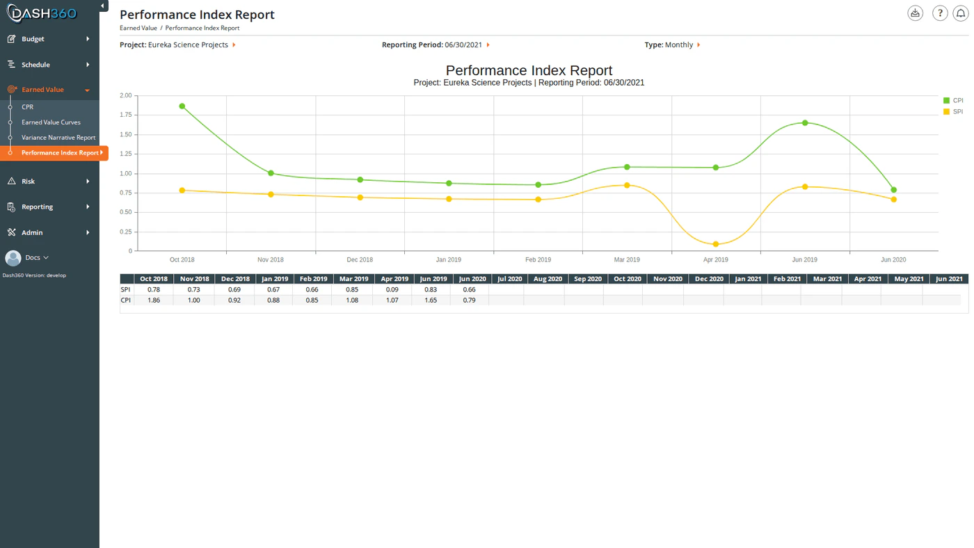
The Performance Index Report strips earned value analysis down to its two most critical health indicators (SPI and CPI) and plots them as spline curves over your project timeline. This is your at-a-glance trend chart: a quick look tells you whether performance is improving, degrading, or holding steady. Below the chart, a data grid shows the exact SPI and CPI values for every reporting period from project start through the selected period. URL:/EarnedValue/PerformanceIndexReport/Index
Prerequisites
- Select a project and reporting period. Both are required before the chart and data grid load.
Reading the Chart
Two spline curves are plotted over your project timeline:| Curve | Metric | Interpretation |
|---|---|---|
| SPI | Schedule Performance Index = BCWP ÷ BCWS | Below 1.0 = behind schedule. Above 1.0 = ahead of schedule. |
| CPI | Cost Performance Index = BCWP ÷ ACWP | Below 1.0 = over budget. Above 1.0 = under budget. |
- Click any legend item to show or hide that curve.
- Hover over a data point to see the exact index value for that period.
- Zoom by clicking and dragging on the chart to focus on a specific date or value range. Both the argument (time) axis and value axis support zooming.
- Pan by holding and dragging after zooming to scroll along either axis.
Data Grid
Below the chart, a pivot-style data grid shows the SPI and CPI values for every reporting period from project start through the selected period.- Rows: One row for SPI, one row for CPI.
- Columns: One column per reporting period, labeled with the period identifier (month/year in Monthly mode, year in Yearly mode). Columns run left to right from earliest period to the selected period.
Available Filters
The Project and Reporting Period selectors appear in the page header. All other filters are in the left-side filter panel, which activates after a reporting period is selected.| Filter | Description | Default |
|---|---|---|
| Project | Required. Loads reporting periods for the selected project. | : |
| Reporting Period | Required. Sets the analysis end point (all periods from project start through this period are shown. | ) |
| Axis | Sets the time granularity of the chart x-axis: Monthly or Yearly. | Monthly |
| WBS | Limit the curves to a specific WBS element and its children. Selecting a WBS also filters the Work Package dropdown. | All WBS |
| Work Package | Further limit to a single work package. Populated based on the selected WBS; select a WBS first. | All WPs |
| CAM | Limit to work packages assigned to a specific Control Account Manager. | All CAMs |
| Start Date | Trim the chart to start at this date. | Project start |
| End Date | Trim the chart to end at this date. | Project end |
| Currency Format | Override the display divisor for this session. | Registry / User Setting |
| Option | Effect |
|---|---|
| None: Use Registry / User Setting | Uses the project’s configured currency format |
| Default | Display values in base currency |
| K Value | Display in thousands |
| M Value | Display in millions |
When to Use This Report
Use the Performance Index Report when you need a quick trend summary for a status meeting or executive briefing. Where the CPR shows you the detail behind each number, the Performance Index Report shows the trajectory; whether things are getting better or worse over time. If both SPI and CPI are trending toward 1.0, the project is recovering. If either index is trending away from 1.0, early corrective action is needed. Use the WBS and Work Package filters to narrow the curves to a specific area of the project when investigating a localized performance issue, then compare those curves against the project-wide view. Use the Axis toggle to switch between monthly granularity (useful for recent periods) and yearly (useful for long-range projects to see the full arc).Exporting
Click the Download icon and select Export to Excel to downloadEVPerformanceIndex.xlsx. The workbook contains two sheets:
| Sheet | Contents |
|---|---|
| EV Chart | The SPI/CPI chart as an embedded image |
| EV Summary Data | The data grid (rows = SPI and CPI, columns = one per reporting period) |