

Overview
The Risk Analysis page runs Dash360’s unified Monte Carlo engine. From a single set of iterations it produces both a project cost distribution and a project finish-date distribution, driven by two sources of variability:- Estimating uncertainty: the spread in activity durations and resource-assignment costs, sampled from their Uncertainty Classes.
- Risk events: the risks in the Risk Register, each rolled against its probability and cost or schedule impact.
/Risk/ScheduleRiskAnalysis/Index
For the full, end-to-end explanation of every variable that feeds the simulation (modes, distributions, calendars, risk routing, correlation, and both contingency decompositions), see How the Dash360 Monte Carlo Works. This page focuses on operating the tool; that page explains the math.
Availability (Pro vs Lite): The Uncertainty Cascade, simulation-mode selection, Activity-to-Activity correlation, the Schedule results, Compare Simulations, and the deeper result views (contingency decomposition, Monte Carlo by WBS, and sensitivity charts) are Risk Pro features. In the Lite tier the page is limited to a Risk-Events-Only cost run with the percentile summary; Pro-only sections show a PRO badge with an upgrade link.
Video walkthrough
A full tour of the Risk Analysis page: setting the uncertainty cascade, running a simulation, reading the cost and schedule distributions, the contingency decompositions, sensitivity charts, and comparing saved runs.Prerequisites
- A project must be selected.
- Uncertainty Classes should be defined for the project. See Uncertainty Classes.
- For risk-driven results, the project’s Risk Register should contain risks with probabilities and Risk (pre-response) and Mitigated Risk (post-response) impacts.
Uncertainty Cascade
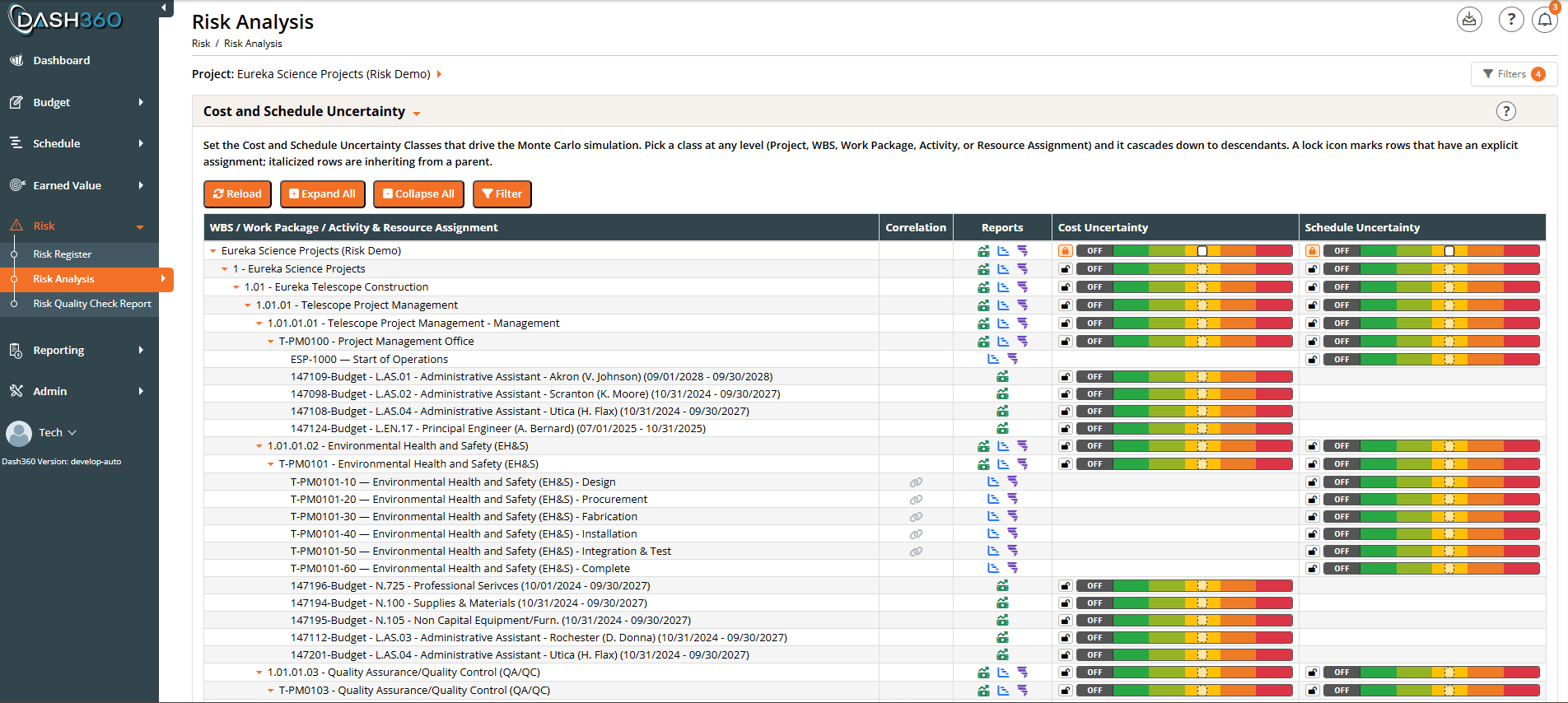
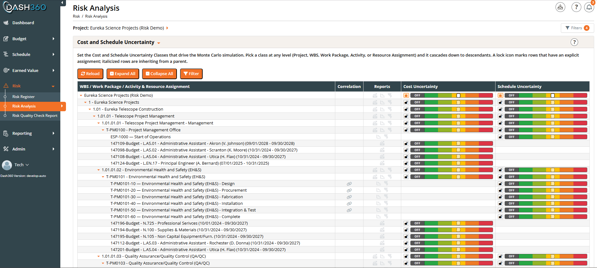
- Set a class on a node to override what it inherits. The override cascades to that node’s children unless they have their own override.
- Lock / Unlock a node with the lock icon: a locked row holds an explicit class; unlocking clears the override and returns the row to inheriting from its parent (inherited rows show in italics).
- OFF sets an explicit no-uncertainty (deterministic single point) class. Unlike unlocking, OFF is itself an explicit assignment that stops inheritance and cascades a deterministic value to descendants; use the lock icon, not OFF, when you want to go back to inheriting the parent’s class.
- Cost Overlay column (Activity and Resource Assignment rows): whether that item’s cost scales with its sampled duration. See The Cost Overlay column below.
- Correlation column (Activity rows): link activities so their duration draws move together in the simulation (Activity-to-Activity correlation). This is a Pro feature. See Correlation and Activity Mapping.
- Reports column: once a simulation has been run or loaded, per-row icons open that node’s Cost Monte Carlo, Schedule Monte Carlo, and Schedule Delay Drivers charts. See Per-node reports (Reports column) for details.
The Cost Overlay column
Cost Overlay ties a cost to a duration: when it is on, an iteration that samples a longer duration also scales that work’s cost. It is only physically true for level-of-effort work (labor, support staff, equipment rental); a firm-fixed-price subcontract or a purchased material costs the same however long the schedule runs. See Uncertainty and Cost Overlay for the full model and the arithmetic. The column shows one clock icon per row, and it appears only on the two row types that carry the flag. Project, WBS, and Work Package rows are blank, the same way Schedule Uncertainty is blank on Resource Assignment rows. Read the icon two ways at once:- Color is the answer: orange means this cost will stretch with its duration, gray means it will not. Scanning for orange shows you every cost that is coupled to the schedule.
- Fill tells you where an orange came from: solid orange was switched on for that row, outline orange is inherited from a mapped activity. Every gray is an outline, whether the off was set on the row or inherited; the tooltip and the picker say which.
Inheritance is permissive: an assignment mapped to several activities overlays if any one of them has overlay on. An assignment mapped to no activity has nothing to inherit, so it reads “No mapped activity” and never overlays; set it to On explicitly if it should.
Because inheritance flows through the activity mapping rather than the tree, setting overlay on an activity changes the resolved state of every assignment mapped to it, wherever those assignments sit in the tree. The cascade reloads after each change so those rows update immediately.
Overlay only changes a number when the activity’s duration actually varies, which means the activity needs a schedule Uncertainty Class to sample from. This makes it a Pro-tier control in practice: the Lite tier runs risk events only, so nothing samples a duration and overlay has nothing to scale.
Filtering which risks are included
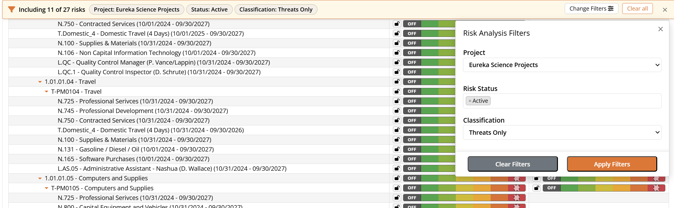
- Risk Status (multi-select): defaults to Active. Add Proposed, Realized, Retired, or Deprecated if you want them in the run.
- Classification: Threats Only (default), Opportunities Only, or All. Threats add cost and extend the schedule; opportunities reduce cost and pull the schedule in.
Running a simulation
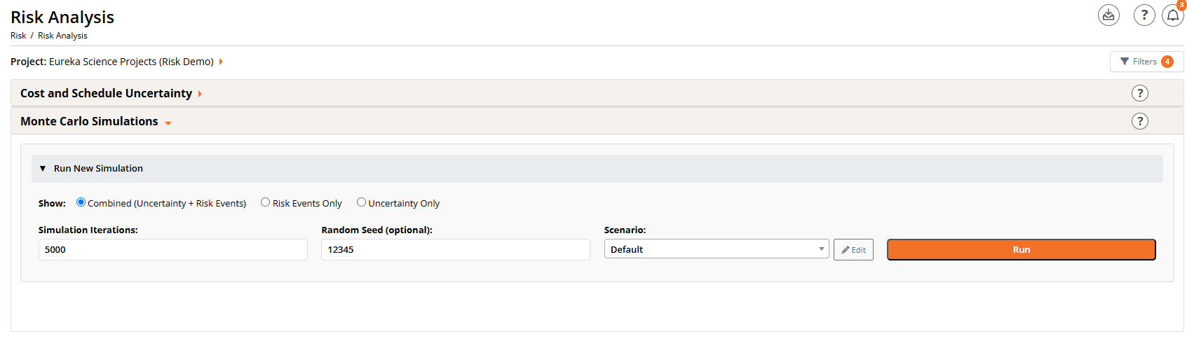
- Mode (the Show choice): pick what the simulation includes before you run it (see below).
- Simulation Iterations: how many Monte Carlo iterations to run (default 5000). More iterations give smoother, more stable percentiles at the cost of a longer run.
- Scenario dropdown and Edit button: optionally run against a saved scenario (see Scenario Planner).
- Random Seed (optional): leave blank for a fresh random seed, or paste a seed to reproduce an earlier run exactly.
- Run: starts the simulation. The chart is hidden while the run is in progress and appears when results are ready.
Simulation modes
You choose the mode before running, because changing it requires a new run:
The chosen mode is echoed in the chart subtitle so a saved or exported chart is self-describing.
Reproducibility (Random Seed)
Every run uses a random seed, shown with the results and saved with the simulation. To reproduce a run, copy its seed into the Random Seed input (the Reuse seed button does this for a loaded simulation) and run again with the same mode and inputs. This is also the clean way to do before/after comparisons: hold the seed fixed and change one input.Scenario Planner
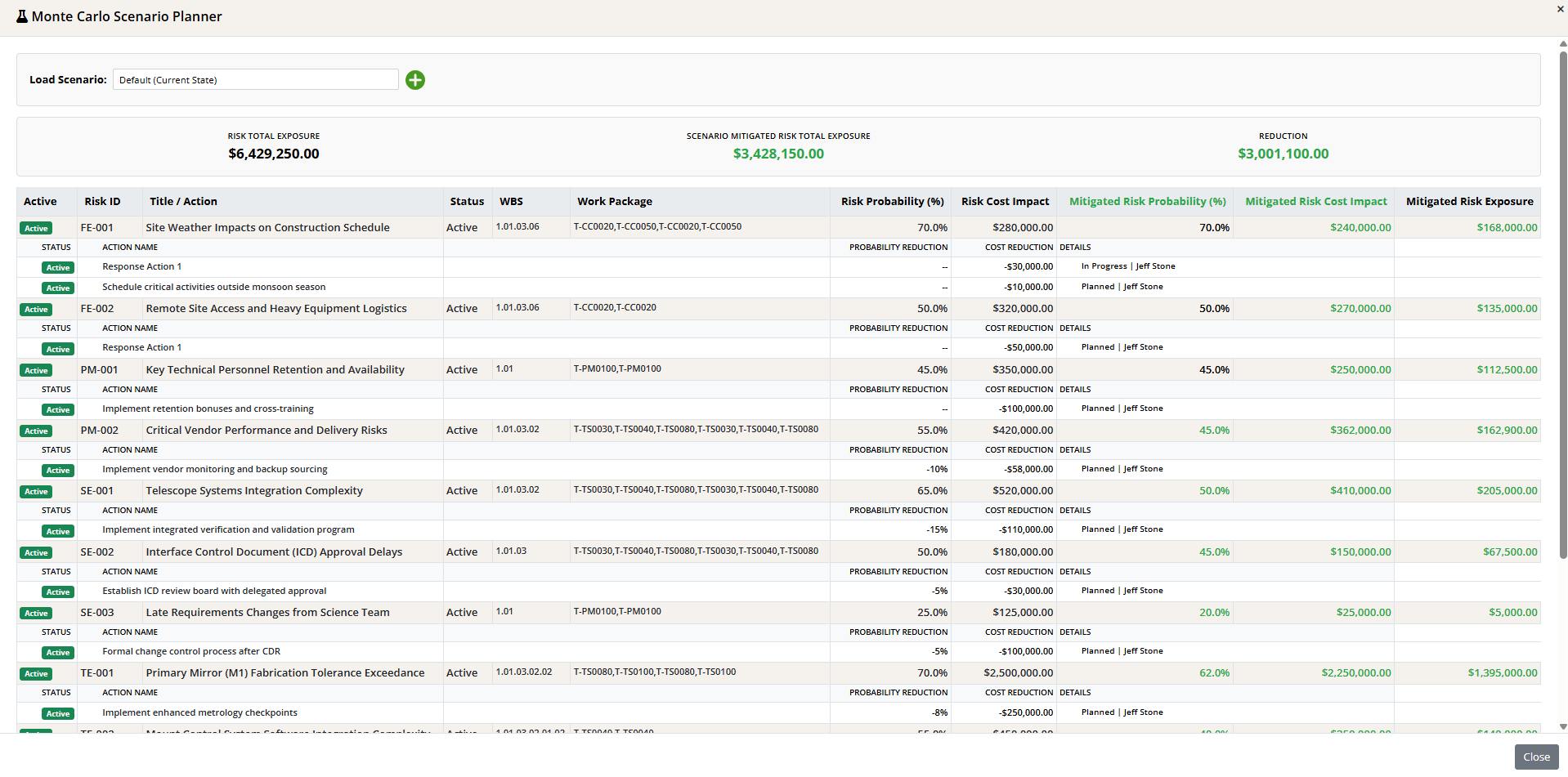
Loading and saving scenarios
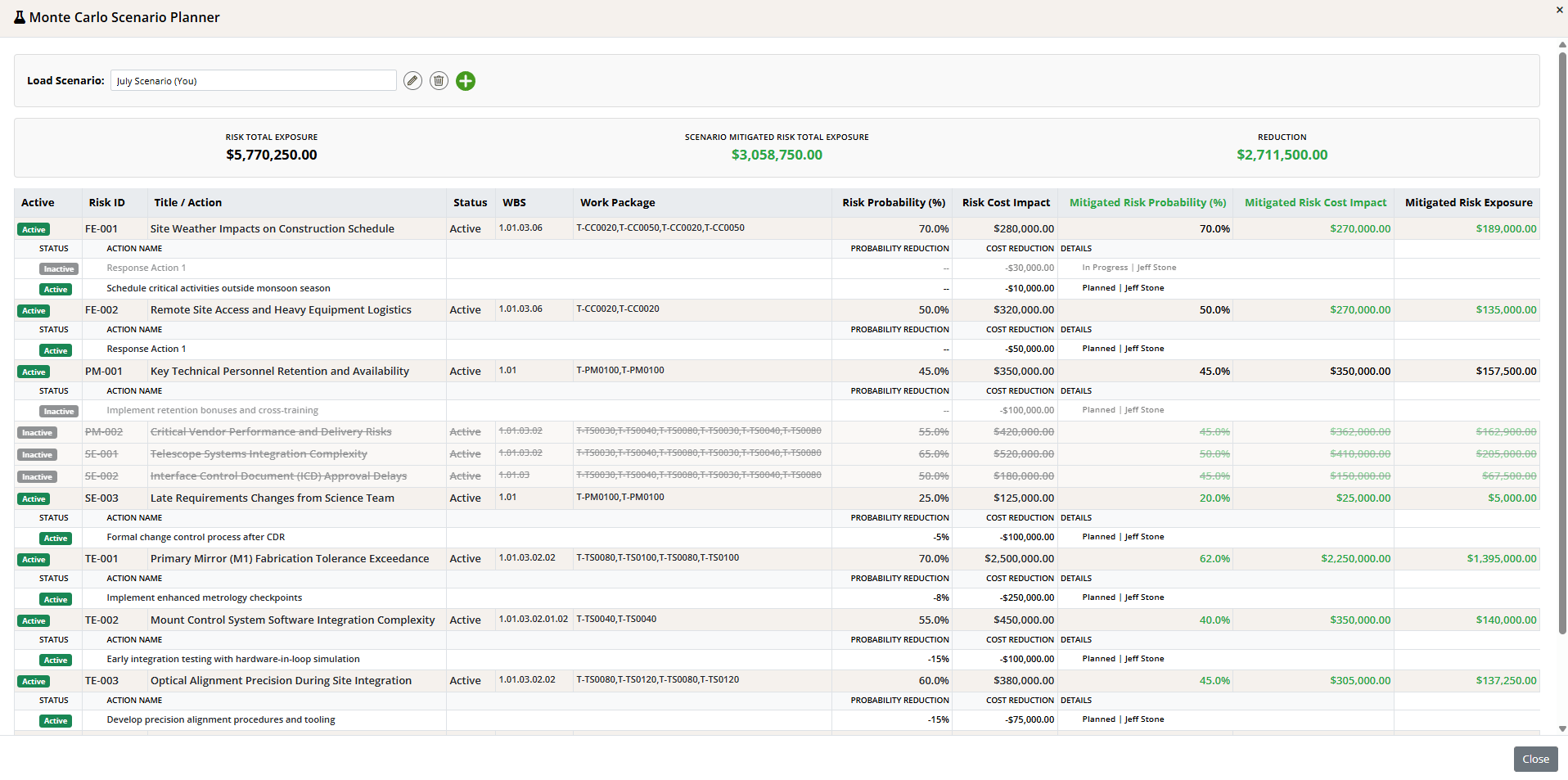
- Add (the + icon): start a new scenario. You must give it a name before you can toggle anything; the planner prompts you if you try.
- Rename (pencil) and Delete (trash) icons appear once a saved scenario is loaded.
- Every toggle auto-saves to the current scenario, so there is no separate save step once it is named.
The summary bar

The risk table

- Deactivating a risk (click its Active badge) excludes it entirely from the scenario: its row is struck through and it drops out of the totals and the simulation. Use this to ask “what if this risk never materializes?”
- Response actions appear as sub-rows under each Mitigate risk, each with its own Active toggle and its Probability Reduction, Cost Reduction, and Details (the action’s status and owner). Only the active actions’ reductions are subtracted from the Risk values to compute the Mitigated Risk numbers, so turning an action off restores its reduction and raises that risk’s Mitigated Risk exposure. Use this to test “what if we drop this mitigation?”
- The Mitigated Risk Probability / Mitigated Risk Cost / Mitigated Risk Exposure values are color-coded: green when the response improves the number, red when it is worse, and black when unchanged.
Reading the Monte Carlo Cost Results
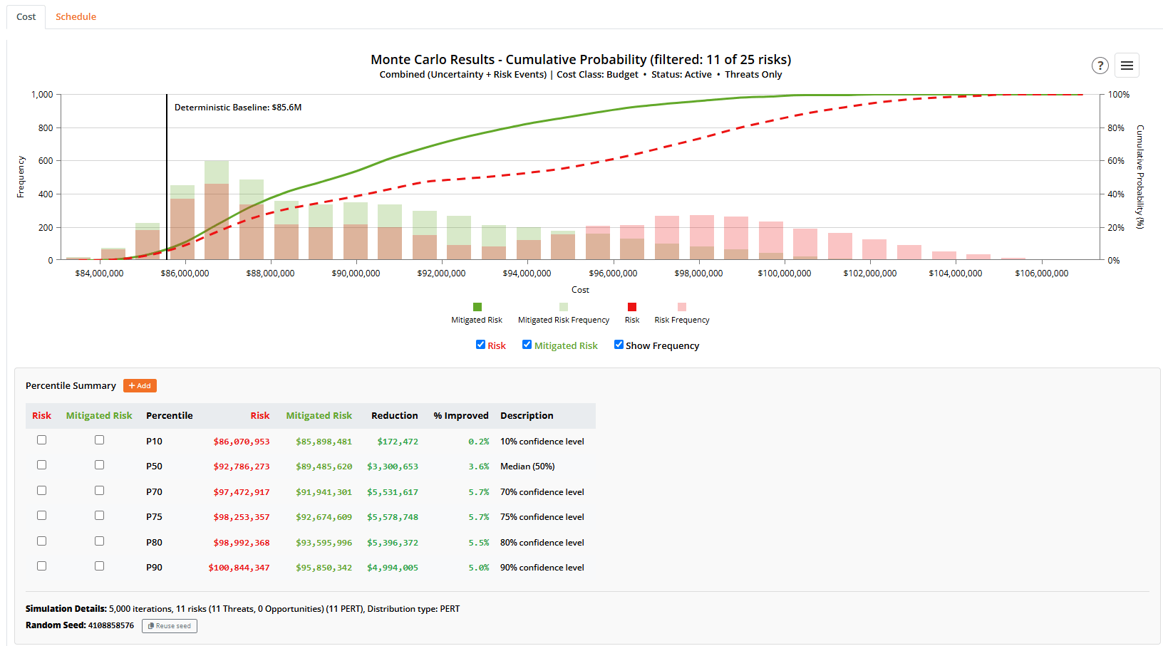
The cost distribution chart
The chart overlays a histogram of iteration costs (the frequency bars) with the cumulative S-curve. The S-curve answers “what is the probability the project comes in at or below cost X?” Percentile lines (P10, P50, P80, and so on) can be toggled on from the Percentile Summary table.Risk and Mitigated Risk
When risks carry both Risk and Mitigated Risk impacts, the chart can show two curves:- Mitigated Risk: the outcome assuming your planned mitigations and response actions are in place. This is the primary view.
- Risk: the outcome before mitigation.
The Risk and Mitigated Risk labels are configurable per project (an administrator can rename them); “Risk” and “Mitigated Risk” are the defaults. They are used consistently on the chart toggles, tables, and comparison views throughout this page.
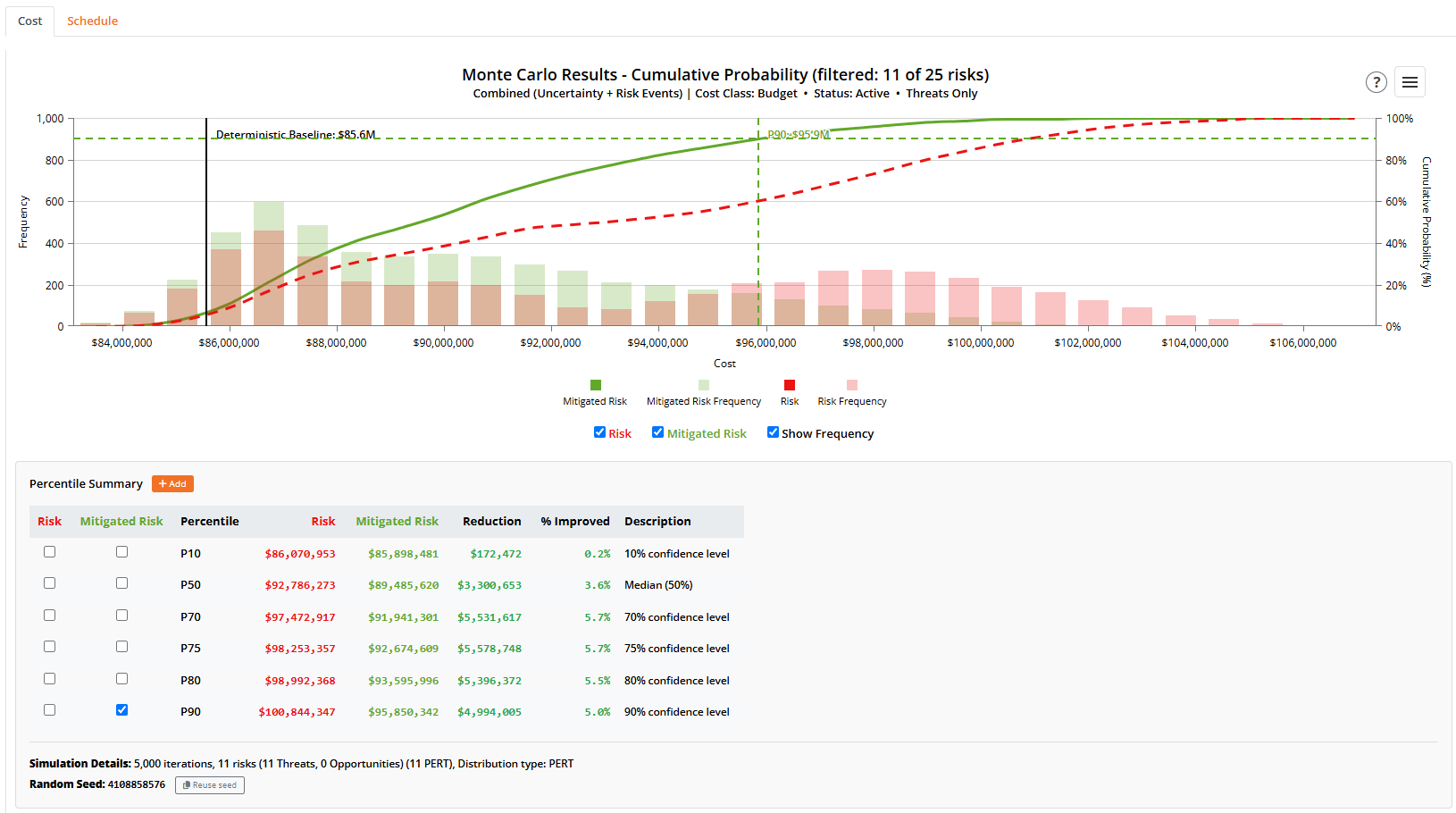
Percentile Summary
The Percentile Summary table lists the cost at each confidence level (P10, P50, P70, P75, P80, P90). When both Pre and Post curves are shown, it also shows the Reduction and % Improved between them. Each row has a Show checkbox to draw that percentile’s line on the chart. Use + Add to add a custom percentile, either by confidence level (for example, P85) or by a target cost value (which the table resolves to the percentile it falls at).Contingency Decomposition
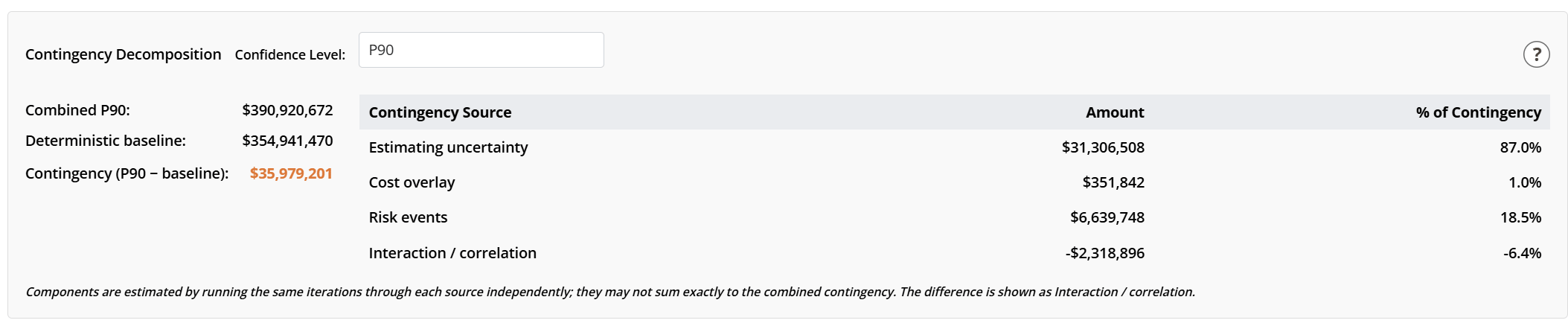
- Combined P[X]: the total project cost at the selected confidence level.
- Deterministic baseline: the point-estimate cost with no uncertainty and no risks.
- Contingency (P[X] minus baseline): the buffer you would hold.
Choosing a confidence level
The Confidence Level picker is populated from the percentiles in the Percentile Summary table (including any custom percentiles you have added) and defaults to P80 (a commonly cited level for cost contingency). Your choice is remembered per project. Changing it updates the numbers instantly, with no need to re-run, because the breakdown is computed from the cached iteration data.Understanding the Interaction line
The three sources are estimated independently, so they do not always sum exactly to the combined contingency; the difference is shown as Interaction / correlation. This line is usually negative, and that is expected and useful: it is unlikely that estimating uncertainty and risk events both land on their high-side outcomes in the same iteration, so the contingency you actually need is less than the sum of the parts. A negative interaction is the diversification benefit of analyzing the sources together. A positive interaction would mean the sources tend to spike together (positive correlation).Monte Carlo by WBS
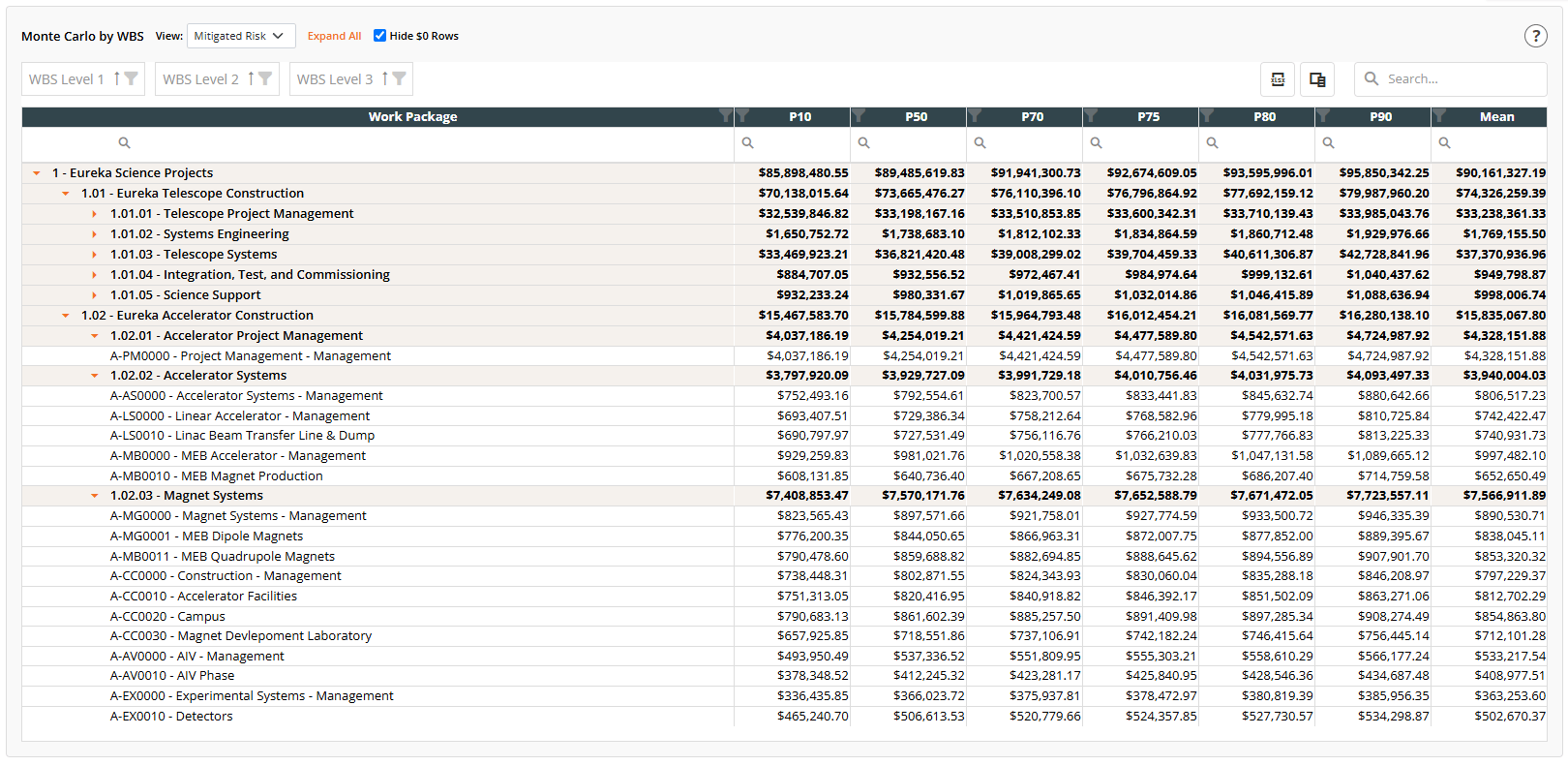
Within every iteration the dollars roll up exactly, so the Mean column ties out top to bottom. The percentile columns do not sum, and should not: a parent’s P80 comes from a different iteration than each child’s P80, so a parent’s upper percentiles are lower (and lower percentiles higher) than the sum of its children. That diversification is the point of project-level Monte Carlo. The
? icon on the rollup explains this; use the Mean when you need a column that adds up.Cost Sensitivity (Top Drivers)
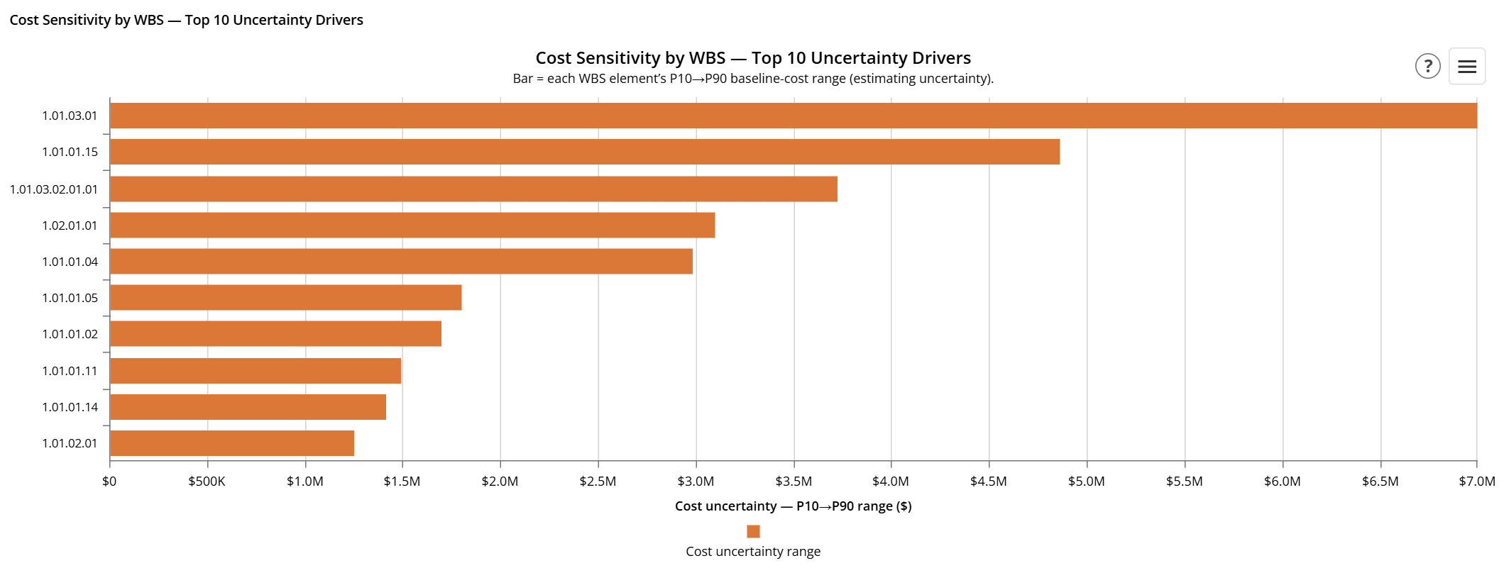
After the WBS rollup, two tornado charts rank what is driving the spread in project cost, so you know where to focus attention.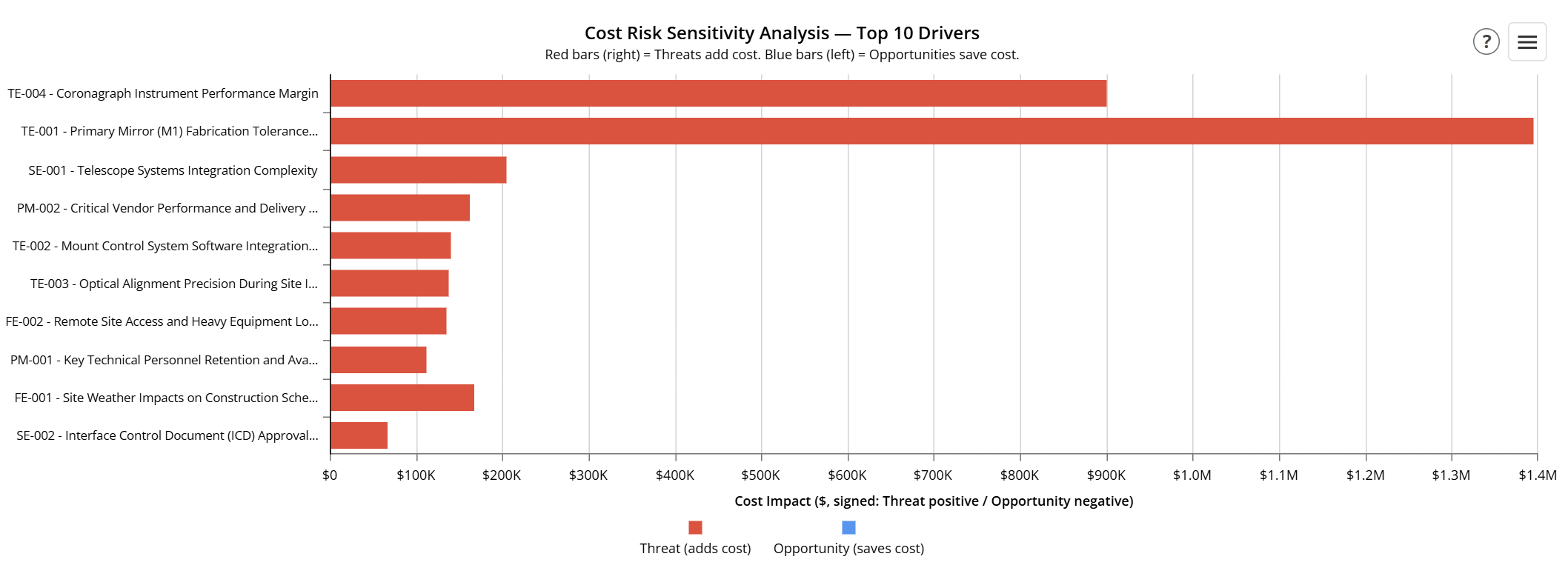
Reading the Monte Carlo Schedule Results
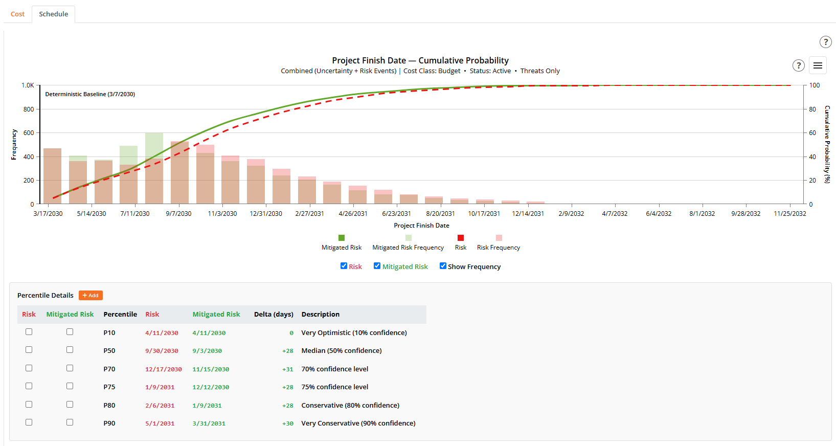
The finish-date distribution chart
The chart overlays a histogram of iteration finish dates (the frequency bars) with the cumulative S-curve. The S-curve answers “what is the probability the project finishes on or before date X?” Toggles above the chart show the Risk curve, the Mitigated Risk curve, and the frequency bars; percentile lines can be turned on from the Percentile Details table.Risk and Mitigated Risk
When risks carry both Risk and Mitigated Risk schedule impacts, the chart can show two finish-date curves:- Mitigated Risk: the finish distribution assuming your planned mitigations and response actions are in place. This is the primary view.
- Risk: the finish distribution before mitigation.
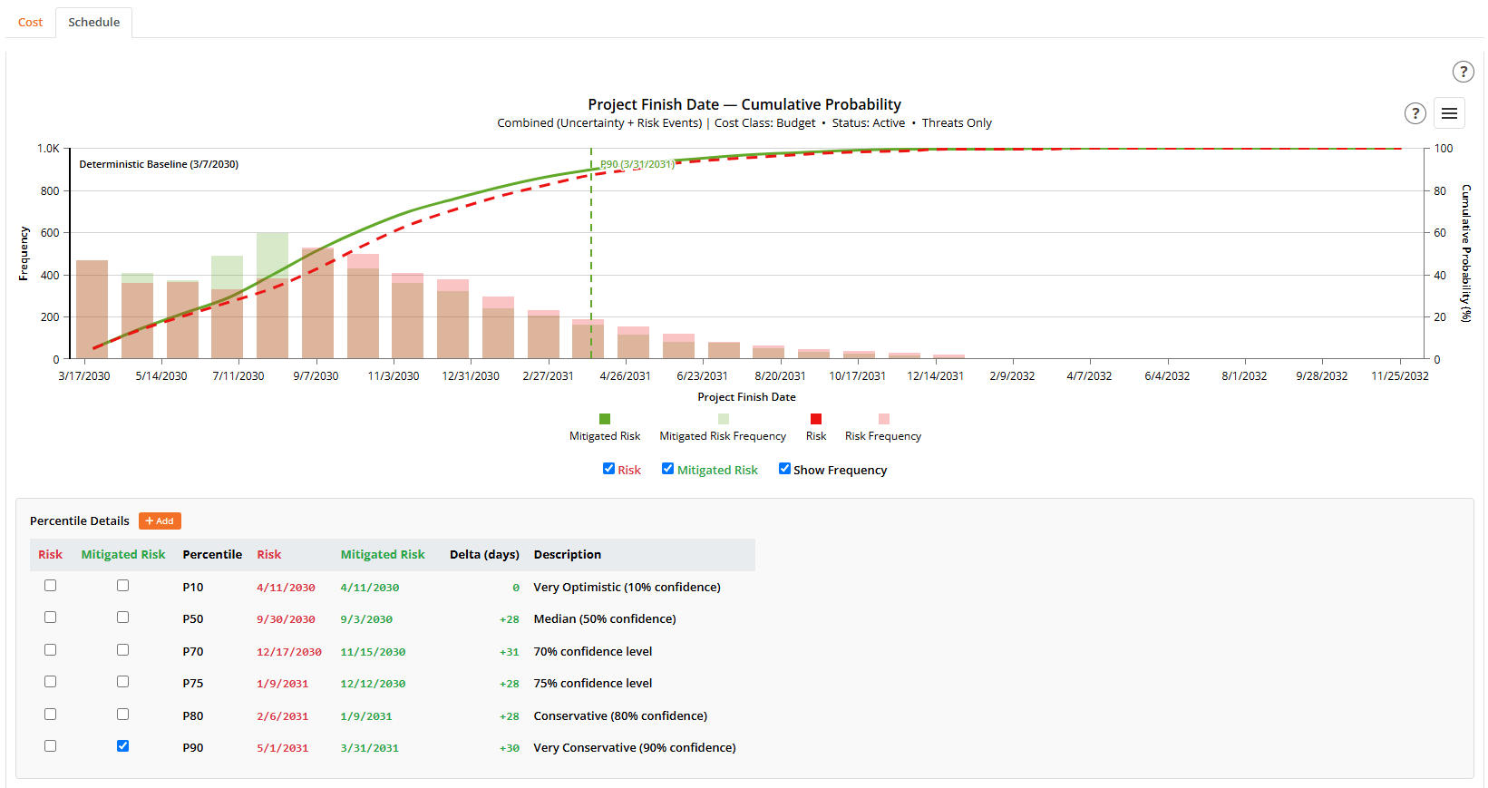
Percentile Details
The Percentile Details table lists the finish date at each confidence level (P10, P50, P70, P75, P80, P90), with a Description and, when both curves are shown, the Delta in days between Pre and Post. Each row has a Show checkbox to draw that percentile’s line on the chart. Use + Add to add a custom percentile either by confidence level (for example, P85) or by a target finish date (which the table resolves to the percentile that date falls at), so you can answer “what is my confidence of finishing by this committed date?”Schedule Contingency Decomposition

There is no cost-overlay source here, since that is a cost-only effect. As on the cost side, the Confidence Level picker (default P80) is populated from the percentiles in the table and recomputes instantly from the cached iterations, and the Interaction / correlation line is usually negative, the diversification benefit of analyzing duration uncertainty and risk events together.
Calendar days versus working days
Each figure is shown in calendar days first, with the working-days equivalent alongside (for example, “134 calendar days (95 working)”):- Calendar days is simply the elapsed time between the two dates. It is unambiguous, and it matches the finish dates and the Delta column used elsewhere on the page (and the Schedule Delay Drivers exposure).
- Working days is that same buffer expressed on the project’s default calendar, that is, its work week and holidays. This is the figure schedulers usually hold as reserve. The two differ by the calendar’s working ratio (roughly 5 in 7 for a standard five-day week, so 134 calendar days is about 95 working days).
Schedule Sensitivity (Top Drivers)
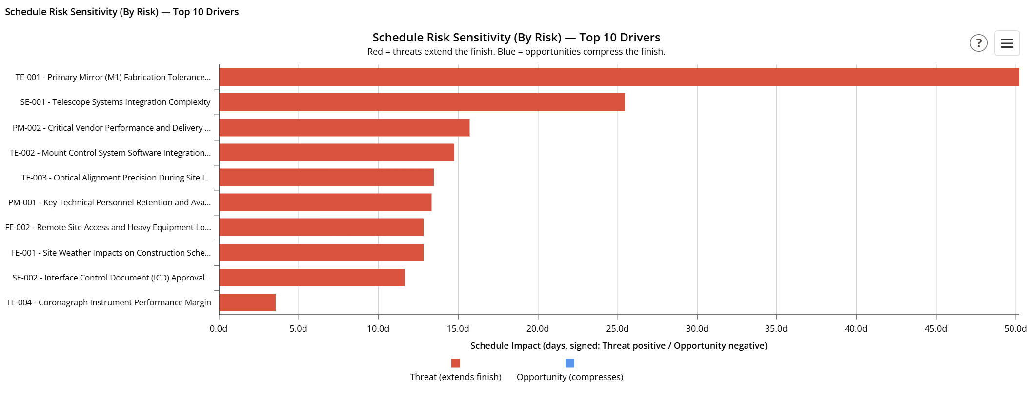
- Schedule Risk Sensitivity (By Risk) ranks the risk events by their effect on the finish date: threats that extend the finish point right (red), opportunities that compress it point left (blue). It is shown for Combined and Risk-Only runs.
- Schedule Sensitivity Analysis (By Activity) — Top 10 Drivers ranks the activities by how many days their duration variation moves the project finish, so you can see which activities the schedule is most sensitive to.
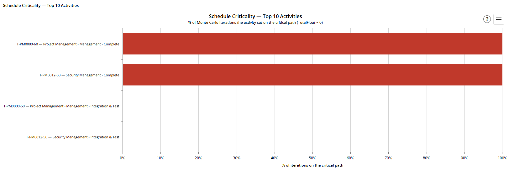
Schedule Criticality
Schedule modeling rules
A few schedule-modeling rules are worth knowing (the? icon on the Schedule tab summarizes them, and the methodology page covers them in full):
- Schedule constraints are ignored (a constrained date never moves, which would distort the analysis).
- Start-to-Finish (SF) links are not modeled; convert them to Finish-to-Start.
- Activities use their own calendar, else the project default, else a 5-day work week.
- A risk’s schedule impact extends its mapped critical-path activities; a risk with no activity mapping extends the project finish directly.
Per-node reports (Reports column)
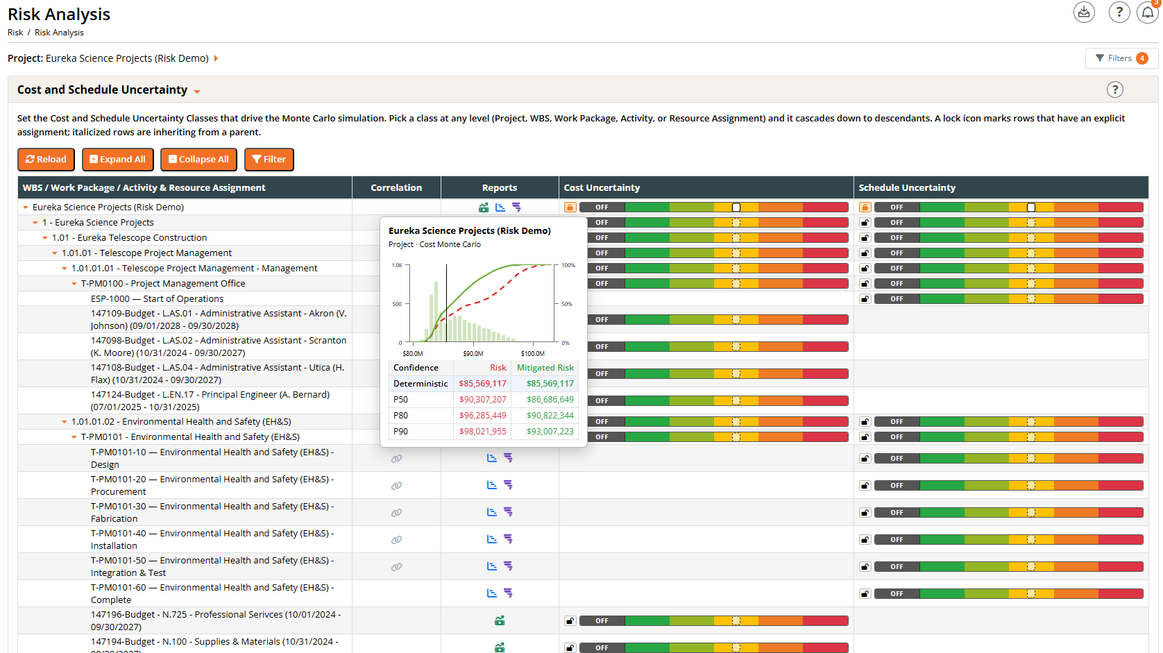
- Cost Monte Carlo (green): the node’s total-cost distribution. Shown on Project, WBS, Work Package, and Resource Assignment rows.
- Schedule Monte Carlo (blue): the node’s finish-date distribution. Shown on Project, WBS, Work Package, and Activity rows.
- Schedule Delay Drivers (purple): the schedule drivers of the node’s finish. Shown on the schedule-driving rows (Project, WBS, Work Package, Activity).
The Cost and Schedule modals
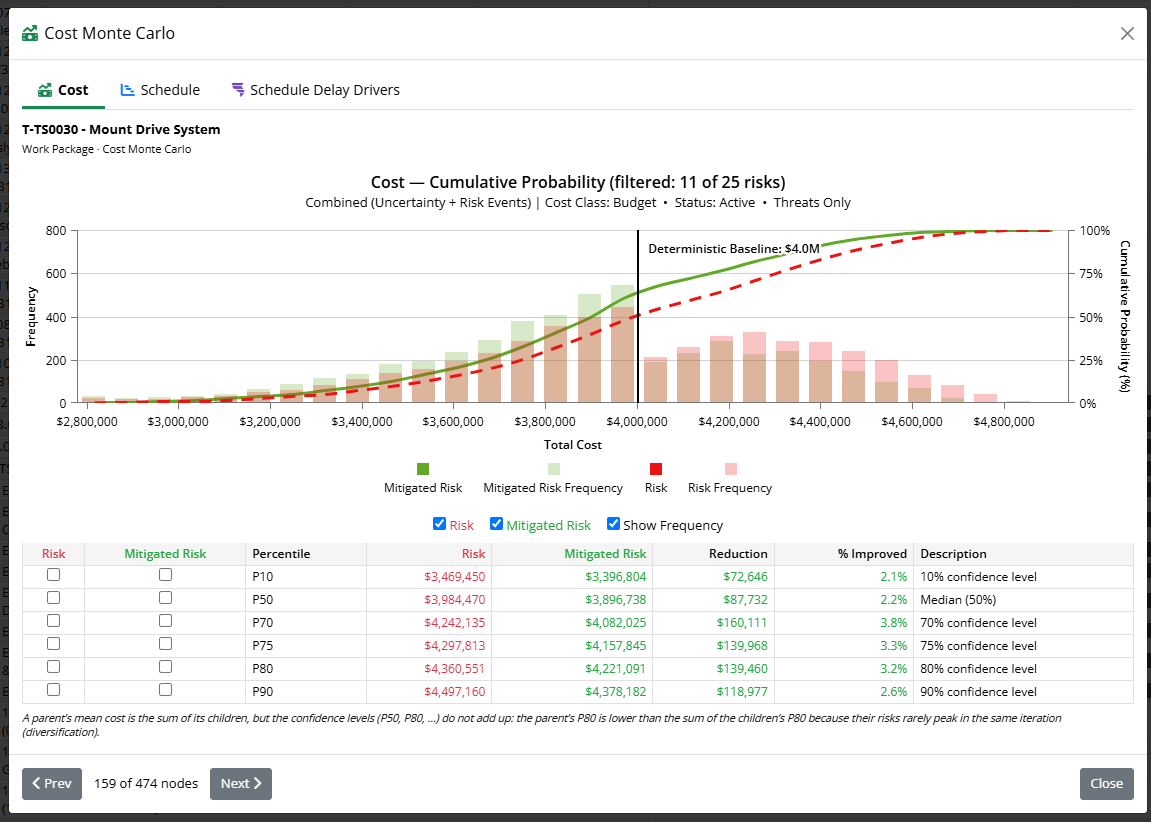
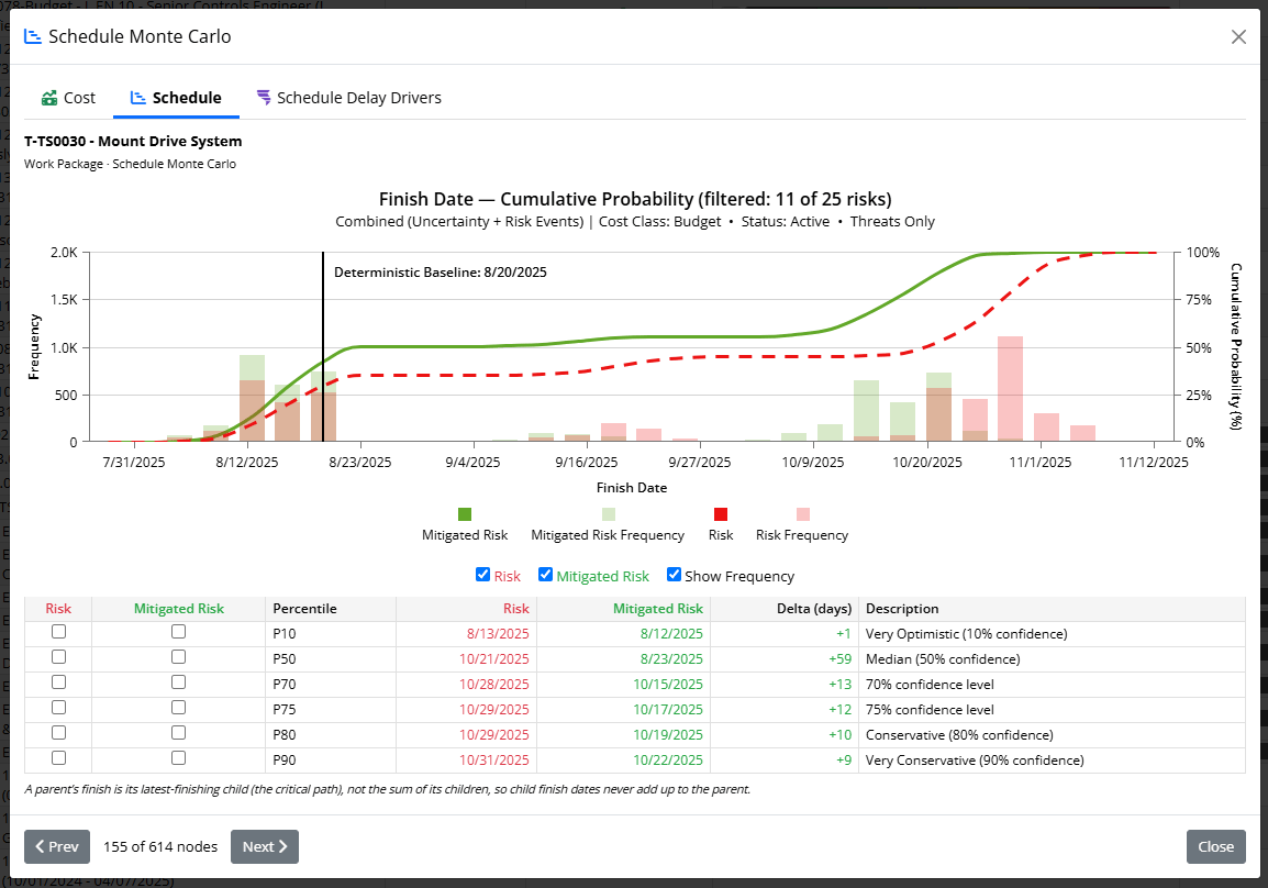
How per-node numbers roll up
Cost and schedule roll up the tree differently, and the modals state this inline:- Cost is additive in the mean: a parent’s average cost equals the sum of its children. Its confidence levels do not add up, though: a parent’s P80 is lower than the sum of the children’s P80, because their risks rarely peak in the same iteration (diversification).
- Schedule is not additive at all: a parent’s finish is its latest-finishing child (the critical path), so child finish dates never sum to the parent, and a child can even show a larger delay than its parent.
Schedule Delay Drivers
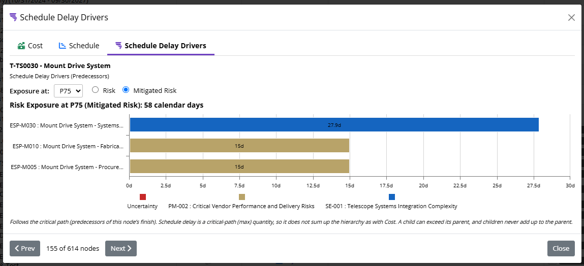
- Pick the exposure P-level (default P75). The bars rescale so they sum to the node’s risk exposure (the P-level finish minus the deterministic finish) at that confidence level.
- Toggle Risk versus Mitigated Risk (shown when the project has mitigations).
Saving and comparing simulations
- Save: give a run a title to save it. Saved runs store the full results, the seed, the mode, the percentiles, the contingency decomposition, and the finish-date distribution, so they reload exactly as they ran.
- Load: pick a saved run from the Previous Simulations list to restore its charts, tables, and decomposition. A reloaded run renders through the same path as a live run, so it looks identical.
- Compare Simulations: open the comparison view to put saved runs side by side (for example, a Risk run against a Mitigated Risk run, or two scenarios), so you can quantify the difference.
Compare Monte Carlo Results
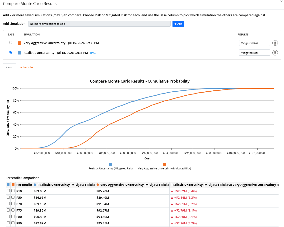
- Add simulation: pick a saved run from the dropdown and click Add. Each added run gets its own color, which is used consistently in the chart, the legend, and the table.
- Results (per run): choose Mitigated Risk or Risk for that run, so you can compare like-for-like or deliberately contrast a Risk run against a Mitigated Risk run.
- Base: the radio button marks one run as the baseline that the others are measured against. The base run is listed first, and every delta in the table reads “base vs other”.
- Remove (trash icon): drop a run from the comparison.
Cost and Schedule tabs
The results are split into two tabs so you can compare a run on either dimension of the same iterations:- The Cost tab overlays each run’s cost S-curve and a Percentile Comparison table of the cost at each confidence level (P10 through P90, plus any custom percentiles). Deltas are shown in dollars and percent; green means the run is lower than the baseline (an improvement), red means higher.
- The Schedule tab does the same for the project finish date: it overlays each run’s finish-date S-curve and lists the finish date at each percentile. Here deltas are shown in calendar days; green means the run finishes earlier than the baseline (an improvement), red means later.
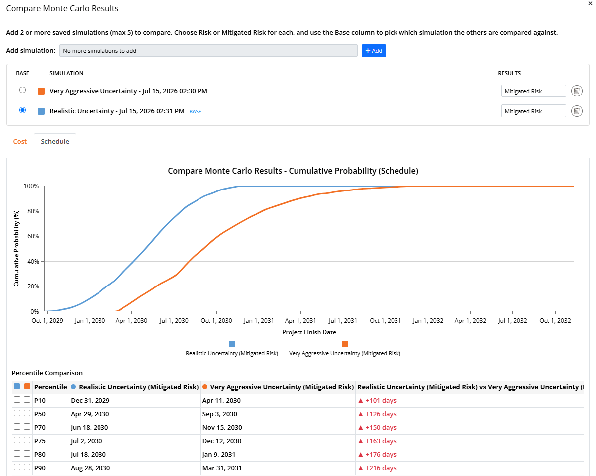
The Schedule tab only includes runs that were saved with finish-date results. Older saved runs (from before schedule results were added) appear in the Cost comparison but are skipped on the Schedule tab; if fewer than two of the selected runs have schedule data, the tab shows a short message instead of a chart. Re-run and save those simulations to compare them on schedule.