Report Studio
Report Studio lets you build your own reports from project cost data without writing any code or SQL. You choose a layout (a grid or a chart), pick the projects and fields you want, arrange them, and save. Saved reports open in the read-only Report Gallery, where any user with access can run them, filter them, and export the results.This guide covers the Designer (where Admins build reports). For running and filtering finished reports, see Report Gallery. For fields and formulas, see Fields and Calculated Fields. For saving and sharing, see Saving and Sharing Reports.
Who can use it
- Building reports: Administrators use the Designer to create, edit, copy, import, and publish reports.
- Running reports: Any user who has access to a report can open it in the Viewer. What each user sees is limited by their Work Package permissions, so two users can open the same report and see different rows.
What you can build
The Designer produces three families of output from the same project data:
All report types read from the same source: time-phased cost data (budget, actuals, and earned value) for the project snapshots you select.
Opening the Designer
- Open the Admin menu.
- Select Report Studio.
- The landing page opens, showing every report you have built or that has been shared with you.
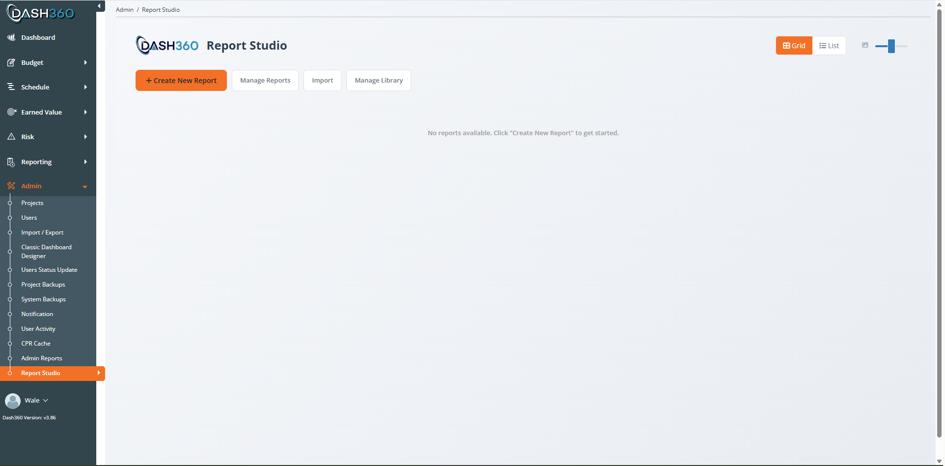
The landing page
The landing page is your library of saved reports.- Card view / List view: Toggle between thumbnail cards and a sortable list using the buttons in the top right. In card view, the slider next to them changes thumbnail size (XS to XL).
- Each report card shows a thumbnail preview, the report name, a type badge (for example, Pivot Grid), and when it was last updated and by whom.
- Card actions (hover over a card): Copy, Export, Open in Viewer, and Delete. Reports that have been shared also show repository actions (Publish, Push Update, Refresh).
Build your first report
This walkthrough builds a simple Pivot Grid of cost by WBS. The same flow applies to every report type.1
Create a new report
Click Create New Report. The Select Report Type window opens with a card for each available layout. Click Pivot Grid.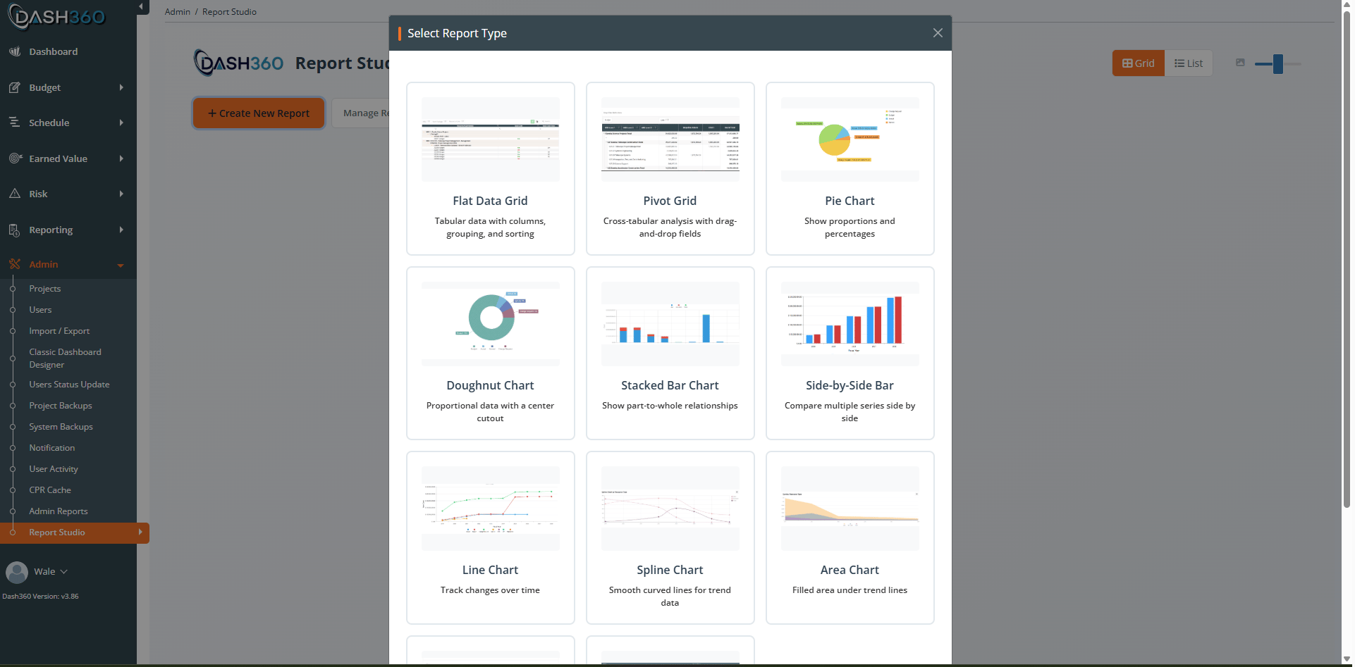
2
Choose your projects
In the Designer, select one or more project snapshots to report on. A snapshot is a saved version of a project’s cost data. You can combine snapshots from several projects in one report.
3
Add fields
Open the field list and drag the fields you want into the layout. For a Pivot Grid you drag fields into four zones: Rows, Columns, Data, and Filter. For this example, drag WBS to Rows and Item Cost to Data.See Fields and Calculated Fields for the full field list and how to build calculated fields.
4
Arrange and refine
Use the configuration panel to set display options (totals, grand totals, word wrap, alternating rows, and similar). The preview on the right updates as you work.
5
Add a header
Give the report a title, subtitle, and description in the header editor. These appear at the top of the report in the Viewer.
6
Save
Click Save, enter a report name and description, and confirm. Dash360 captures a thumbnail of the current preview automatically and adds the report to your landing page.
7
Open it in the Viewer
Back on the landing page, click the Open in Viewer icon on the report card to see exactly what your users will see. See Report Gallery.
Report types reference
You pick the report type when you click Create New Report. The type determines the layout and which configuration options appear, but every type reads the same project cost data.For step-by-step build instructions and every configuration option, see the dedicated guides: Flat Data Grid, Pivot Grid, and Charts.
Data tables
Flat Data Grid
Flat Data Grid
A tabular report with columns, grouping, sorting, filtering, and column totals. Choose the columns to display, set group rows and summary footers, and let users sort, filter, group, and search at run time. Best when users need detailed rows or want to export raw data to Excel.
Pivot Grid
Pivot Grid
A cross-tabular report. Drag fields into Rows, Columns, Data, and Filter zones to summarize cost across two dimensions at once (for example, WBS down the side and fiscal year across the top). Best for analysis and roll-ups. Users can expand and collapse, and rearrange fields at run time.
Comparison charts
Pie and Doughnut
Pie and Doughnut
Show proportions of a whole (for example, cost share by Resource Type). The Doughnut is a Pie with a hollow center. A three-step setup picks the grouping, the value type, and the values to include. Options include small-value grouping, an optional data table below the chart, and Excel export.
Bar Chart
Bar Chart
Compare a single value across categories (for example, cost by CAM). Category-based, with no time dimension.
Side-by-Side Bar
Side-by-Side Bar
Compare several series next to each other across categories. Shares its setup with the Stacked Bar; the difference is that bars sit beside each other instead of stacking.
Stacked Bar
Stacked Bar
Show part-to-whole relationships across categories or time, with series stacked into a single bar. Supports the Smart Monthly time period (choose how many months to show and where the window starts).
Trend charts
Line, Spline, and Area
Line, Spline, and Area
Track cost over time. Line uses straight segments, Spline uses smooth curves, and Area fills the space under the line. All three share the same setup and use a time-based horizontal axis (months, quarters, or fiscal years).
Small multiples
Trellis Chart
Trellis Chart
Draws one small chart per group value and lays them out side by side (small multiples), so you can compare the same pattern across many groups at once.
Where to go next
Build a specific report typeFlat Data Grid
Tabular rows, columns, grouping, and totals.
Pivot Grid
Cross-tab analysis with drag-and-drop zones.
Charts
Pie, bar, stacked, line, area, and trellis.
Fields and Calculated Fields
Pick base and dynamic fields, and build calculated fields including Budget vs Actual.
Calculated Field Cookbook
Ready-to-use formulas and how to fix wrong results.
Saving and Sharing Reports
Save, control visibility, copy, export/import, and publish.
Report Gallery
Find, run, filter, save views, and export every standard and custom report in one place.
Understanding Your Data
Snapshots, filters, permissions, caching, and pitfalls.